

Project Information
Rerun builds the open source software that lets robotics teams visualize what their robots see, then log, query and train on the data behind it. One data layer for Physical AI.
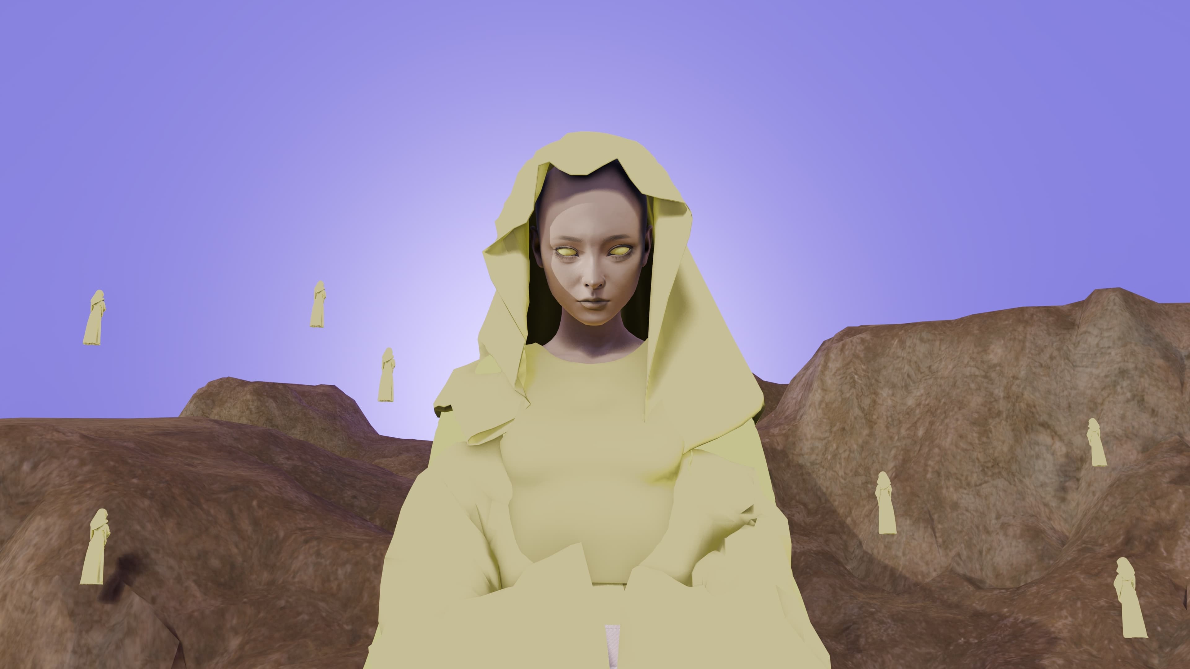
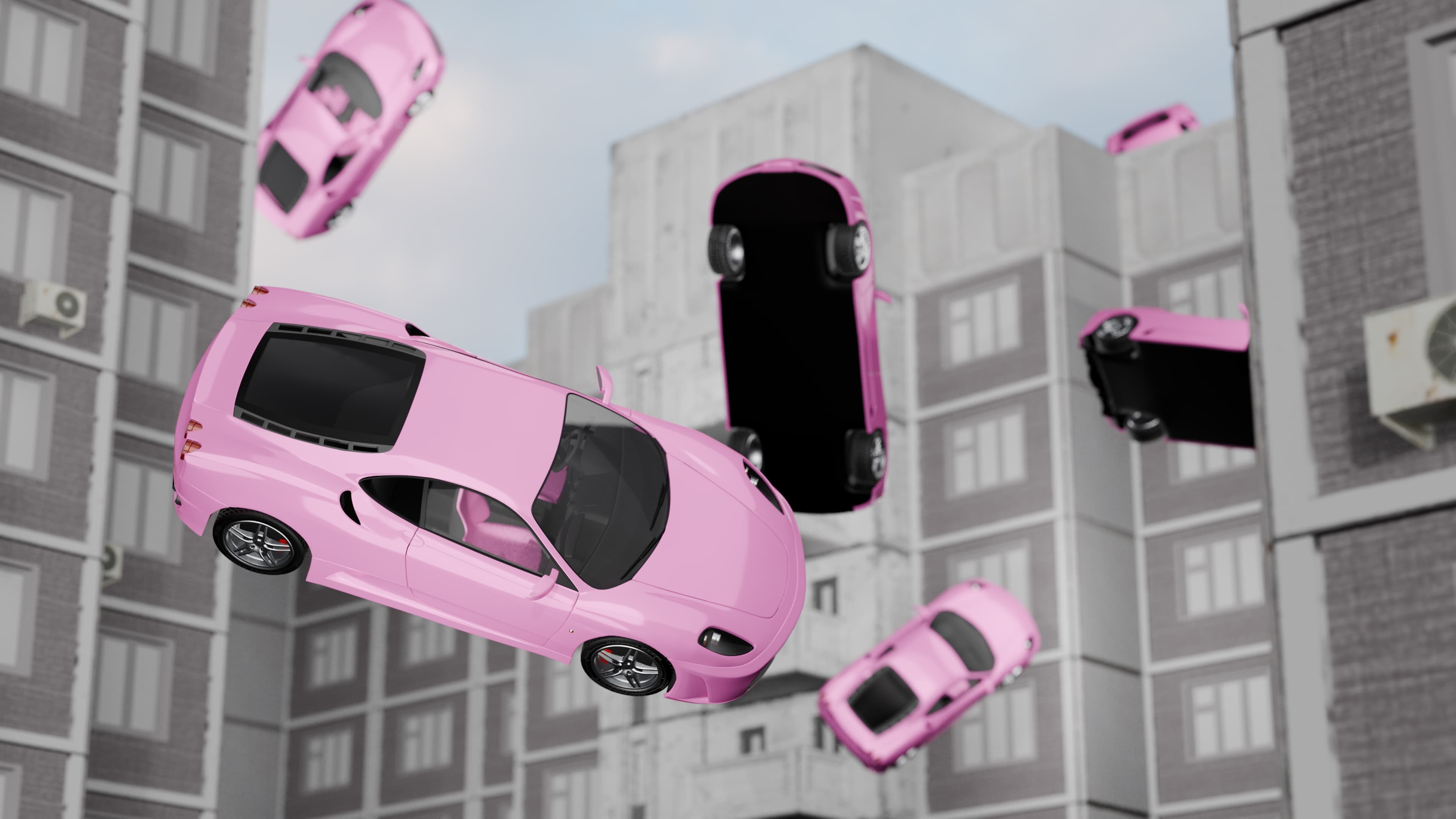
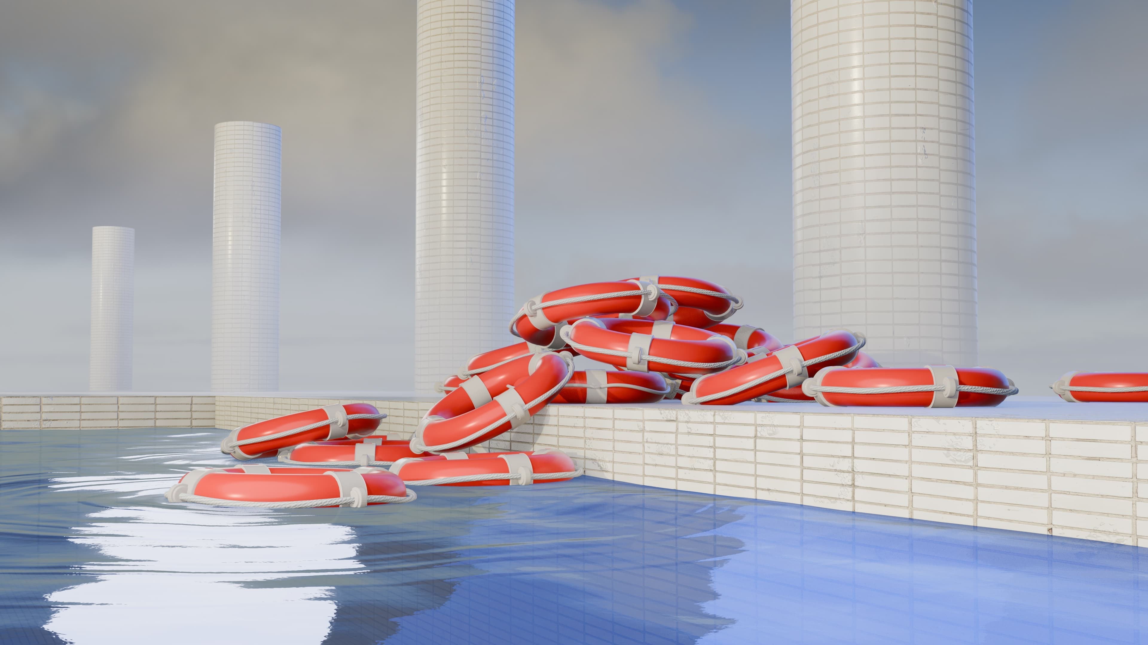
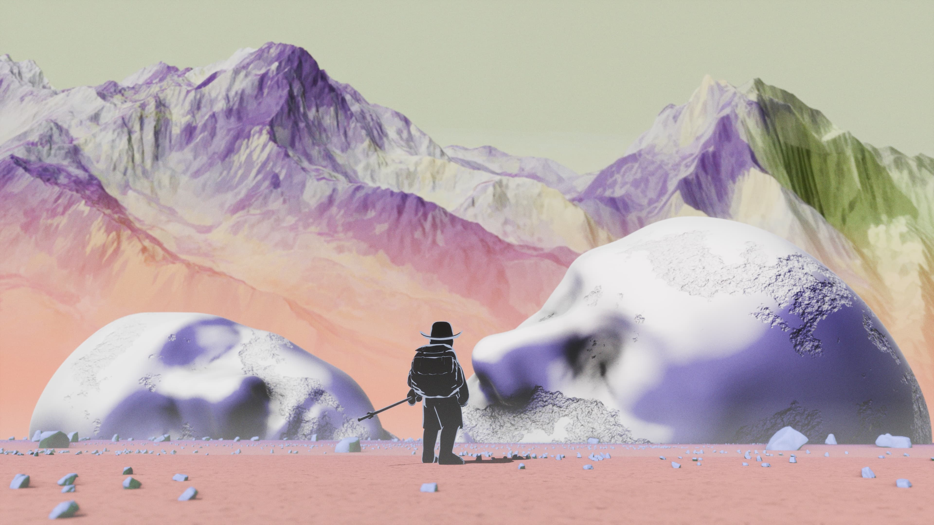
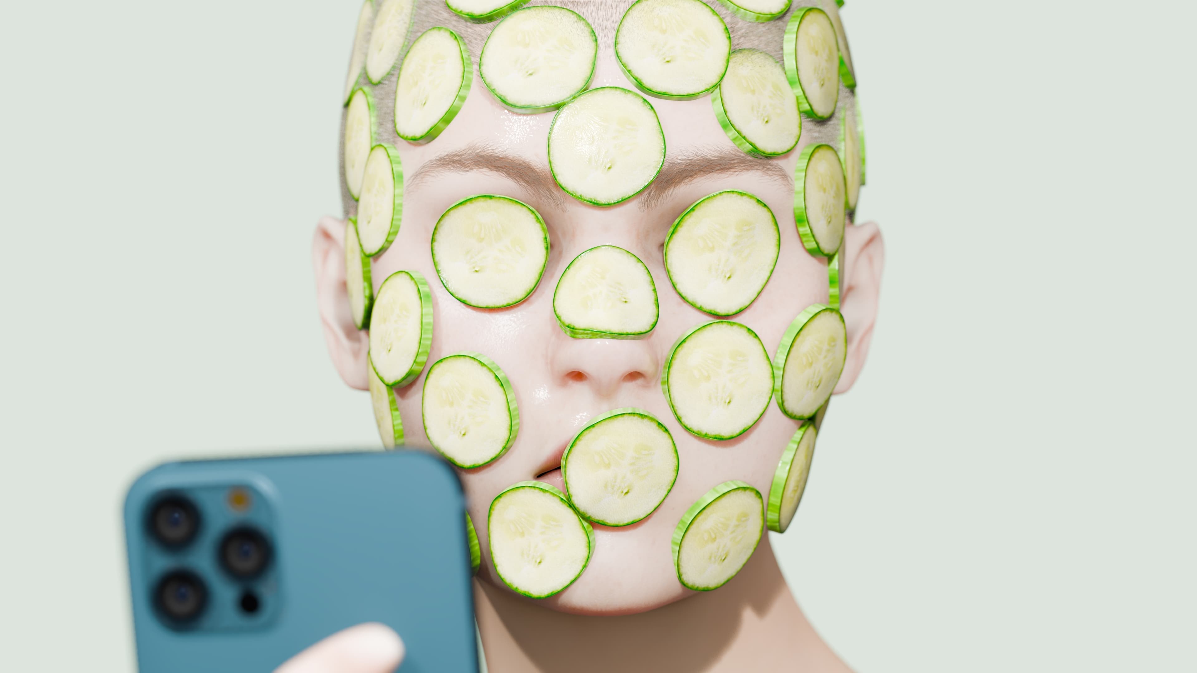
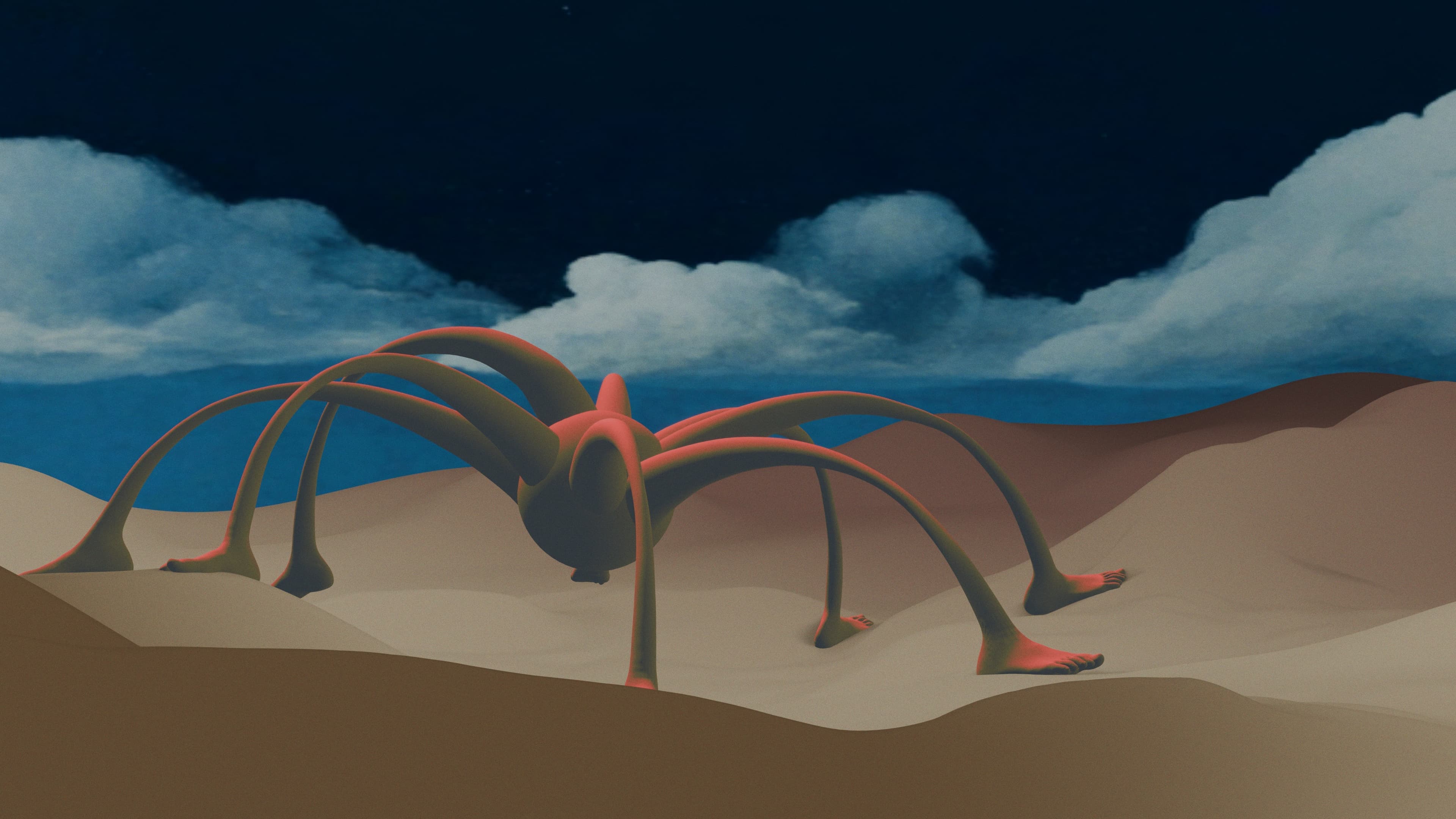
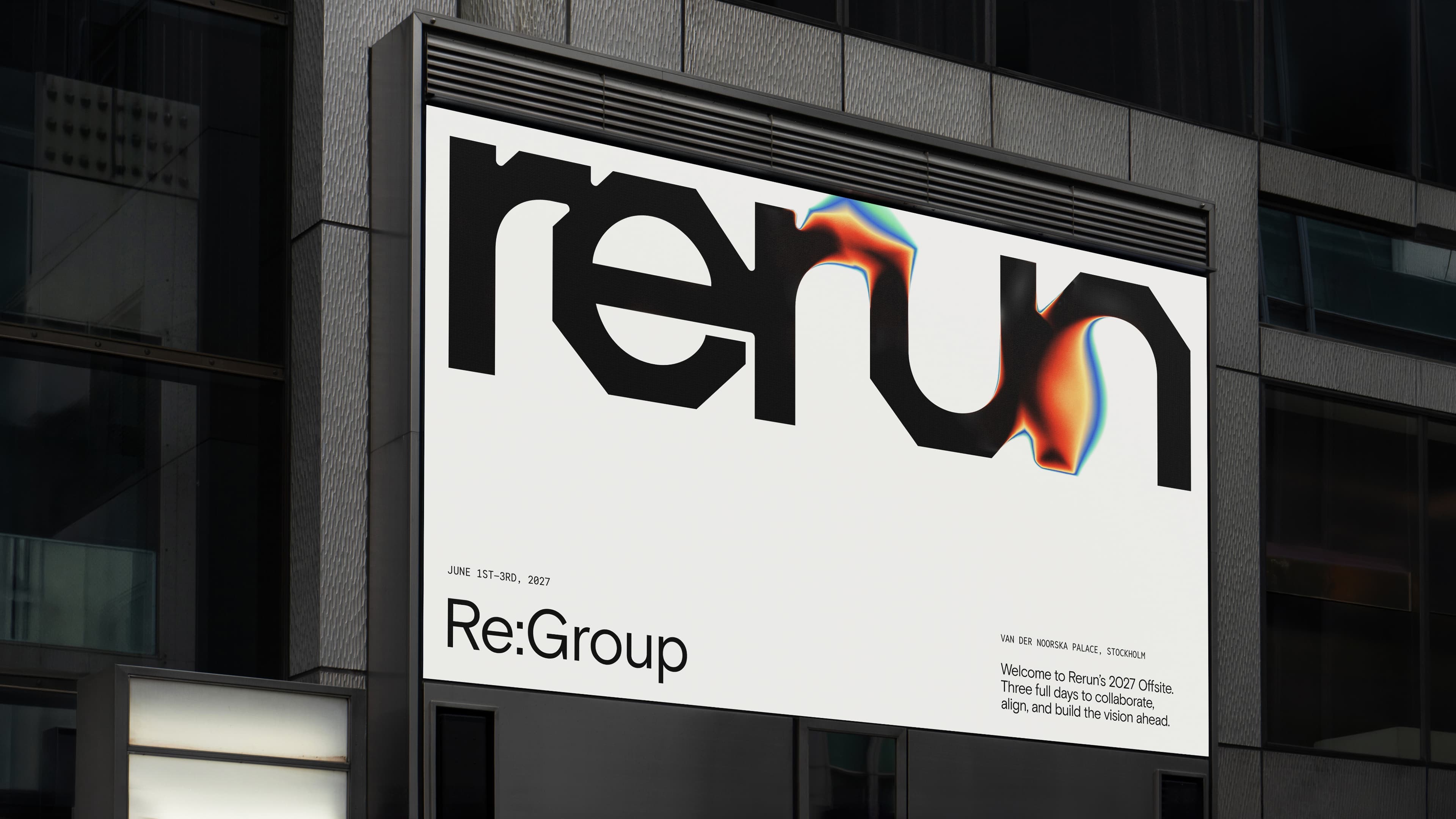
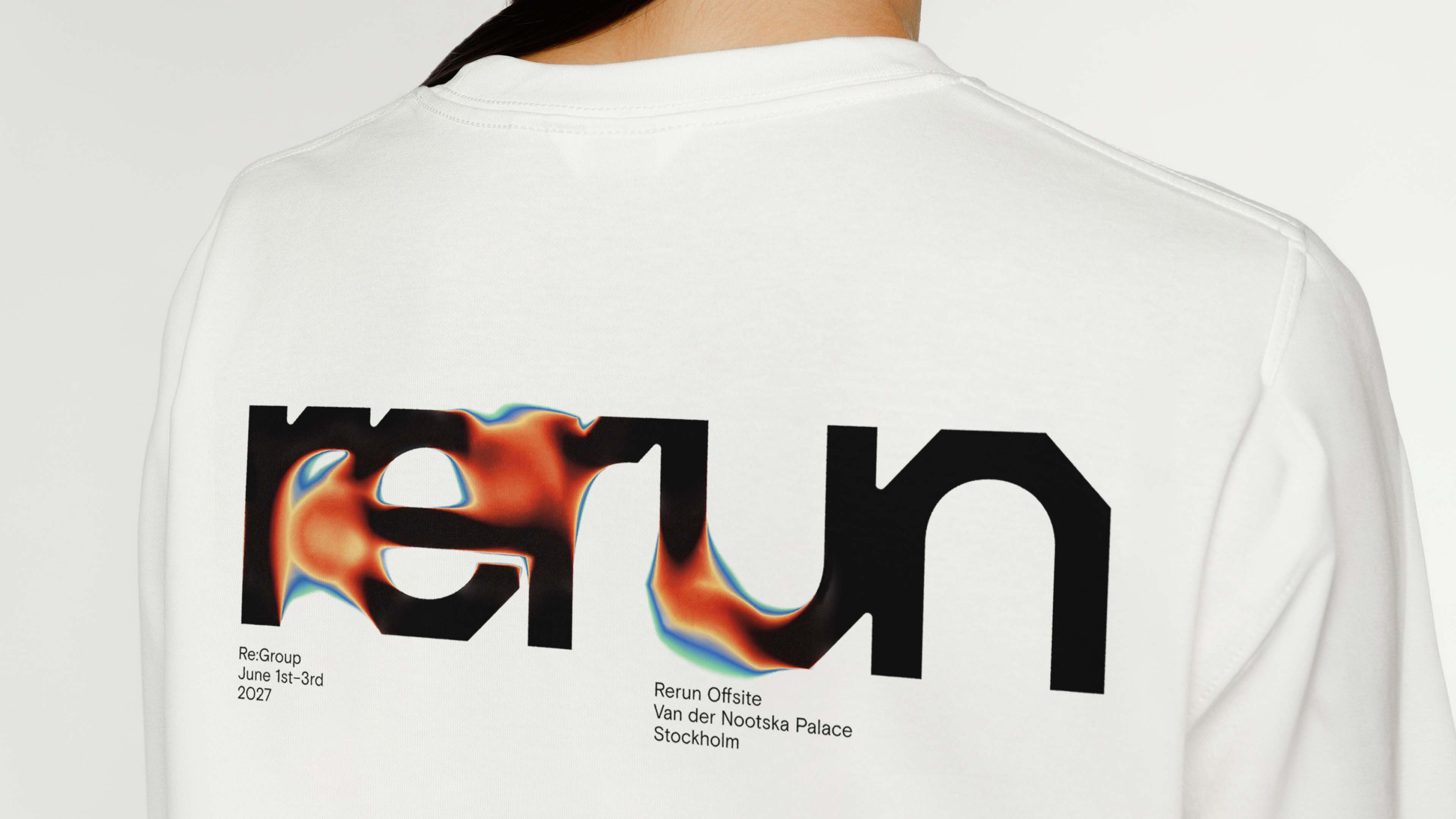
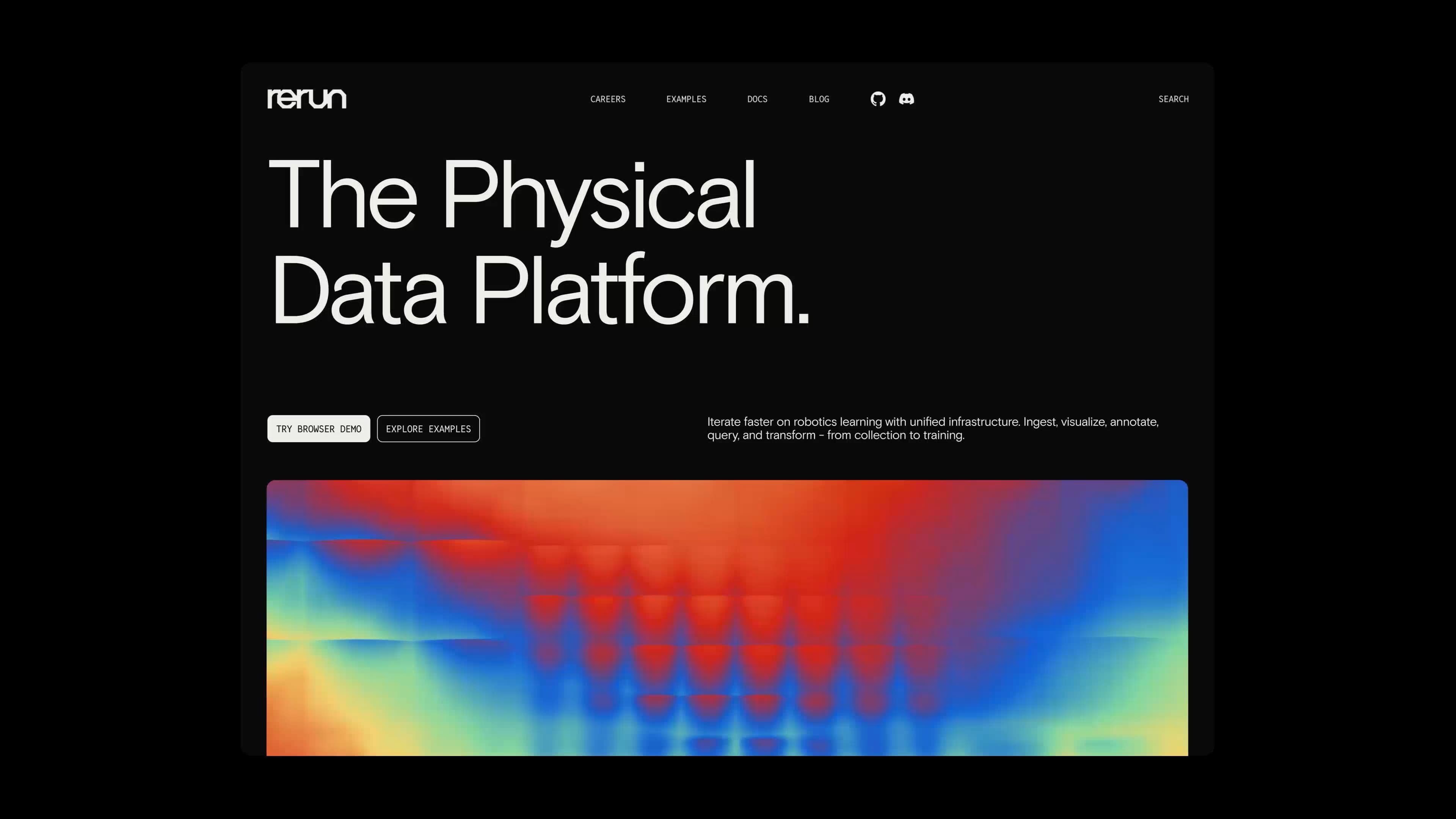
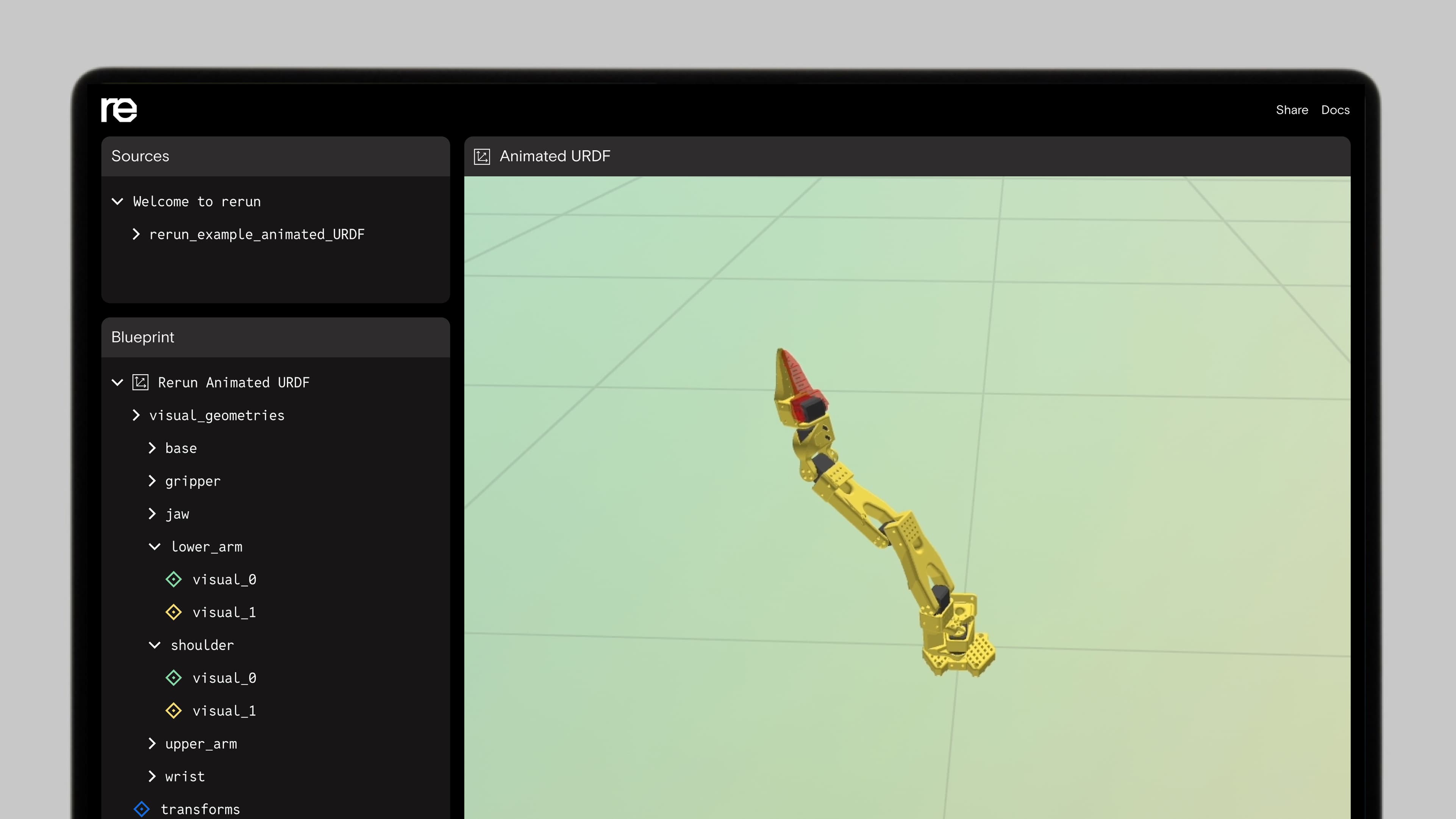
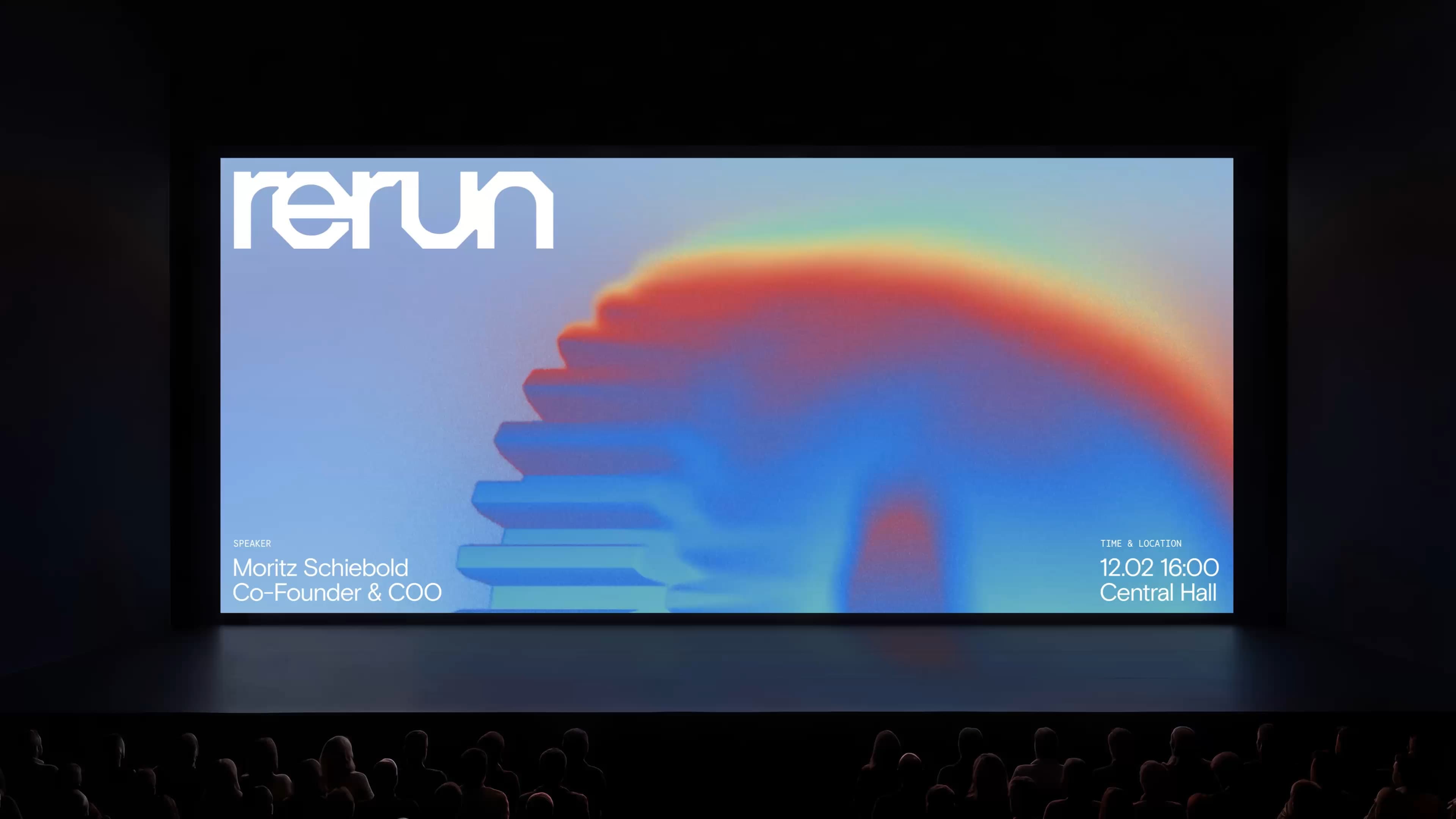
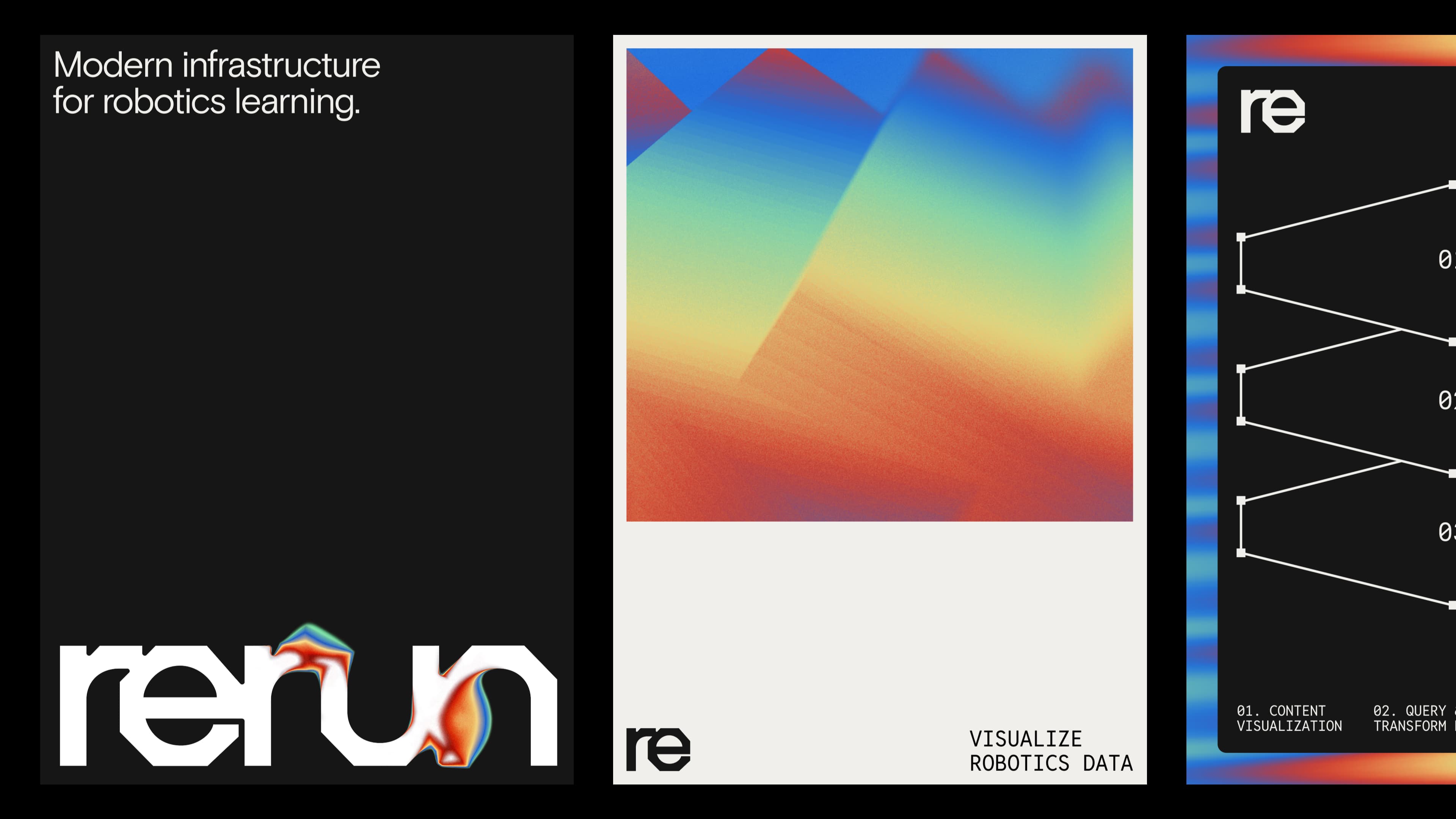
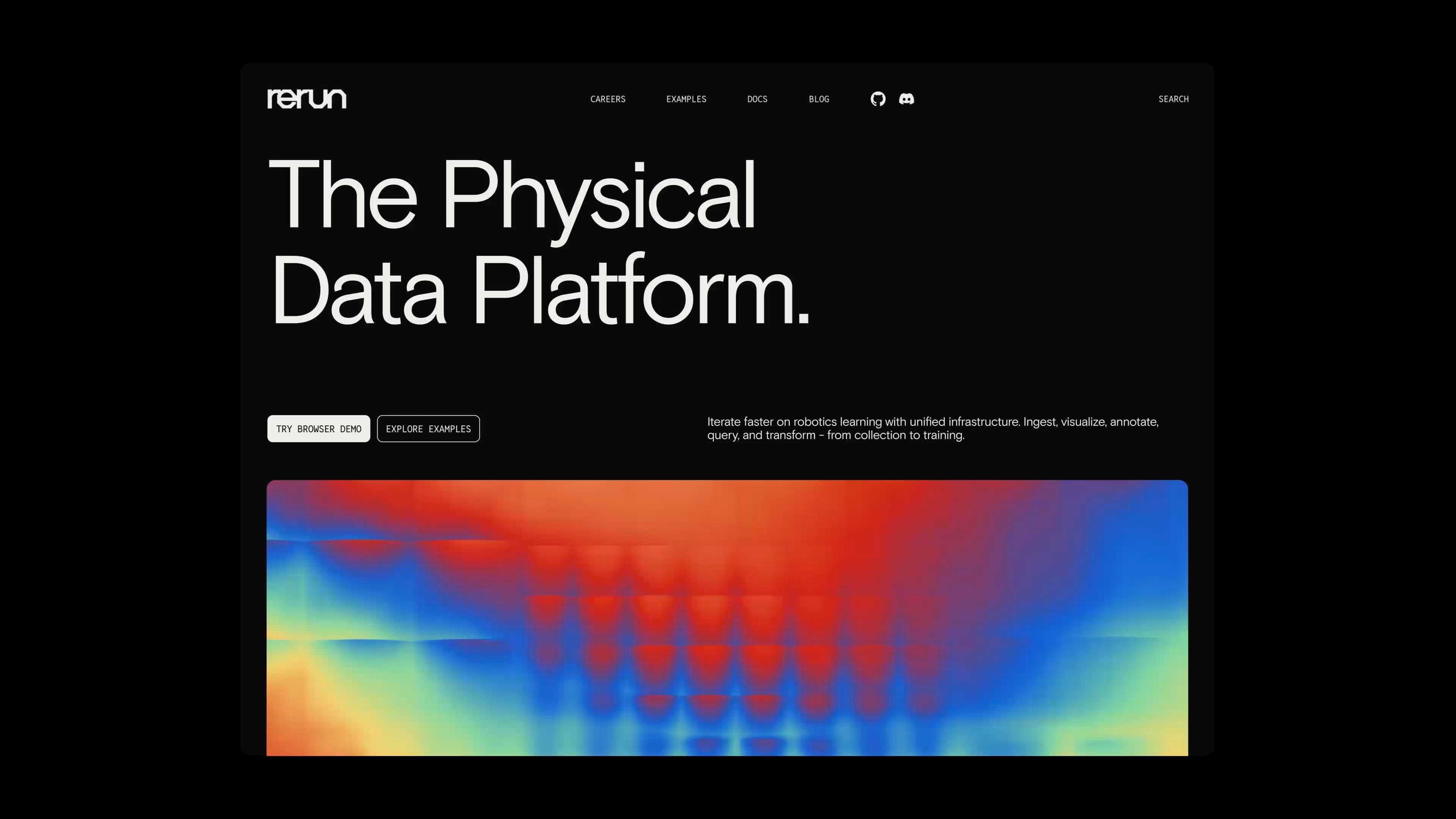
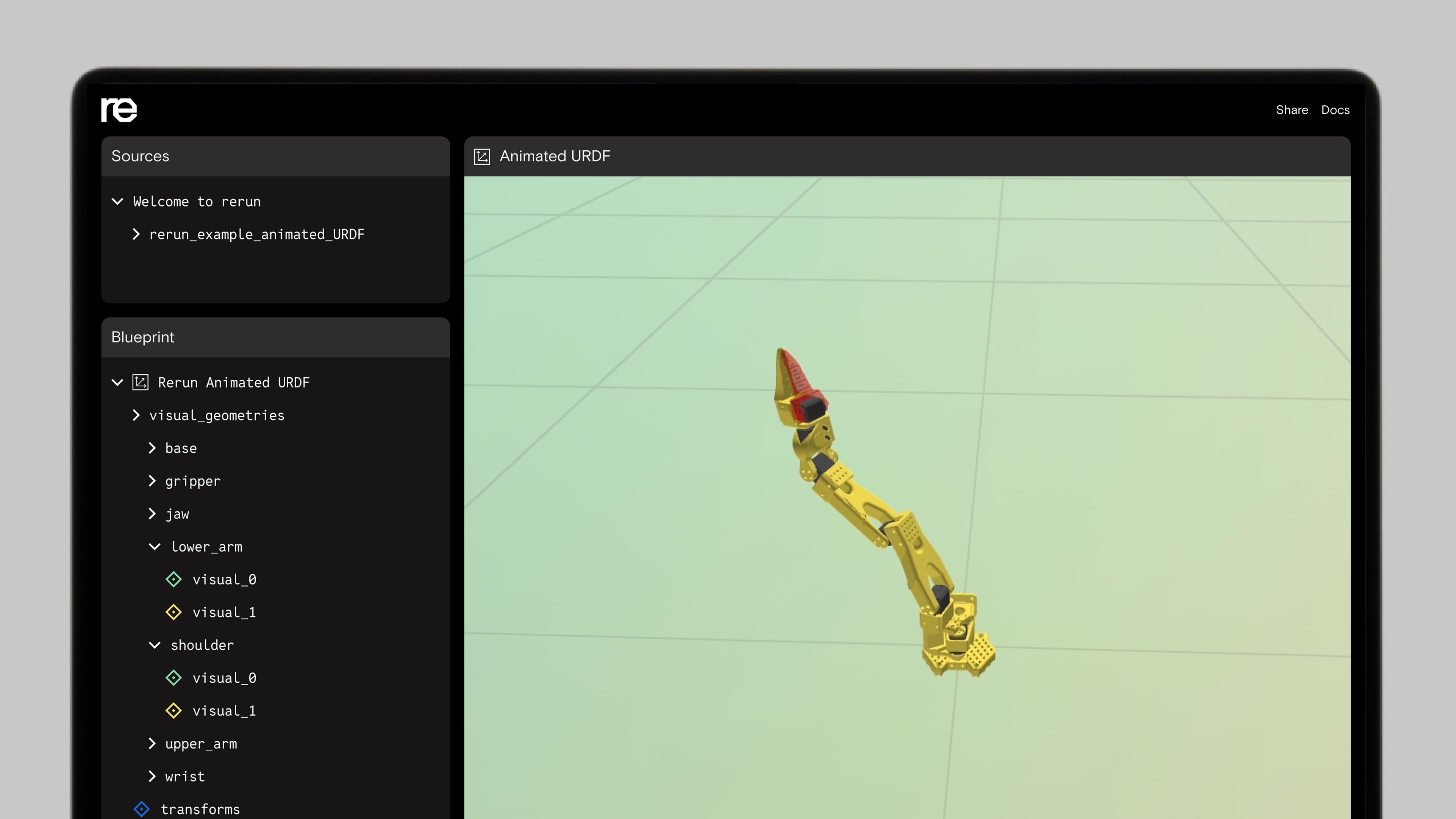
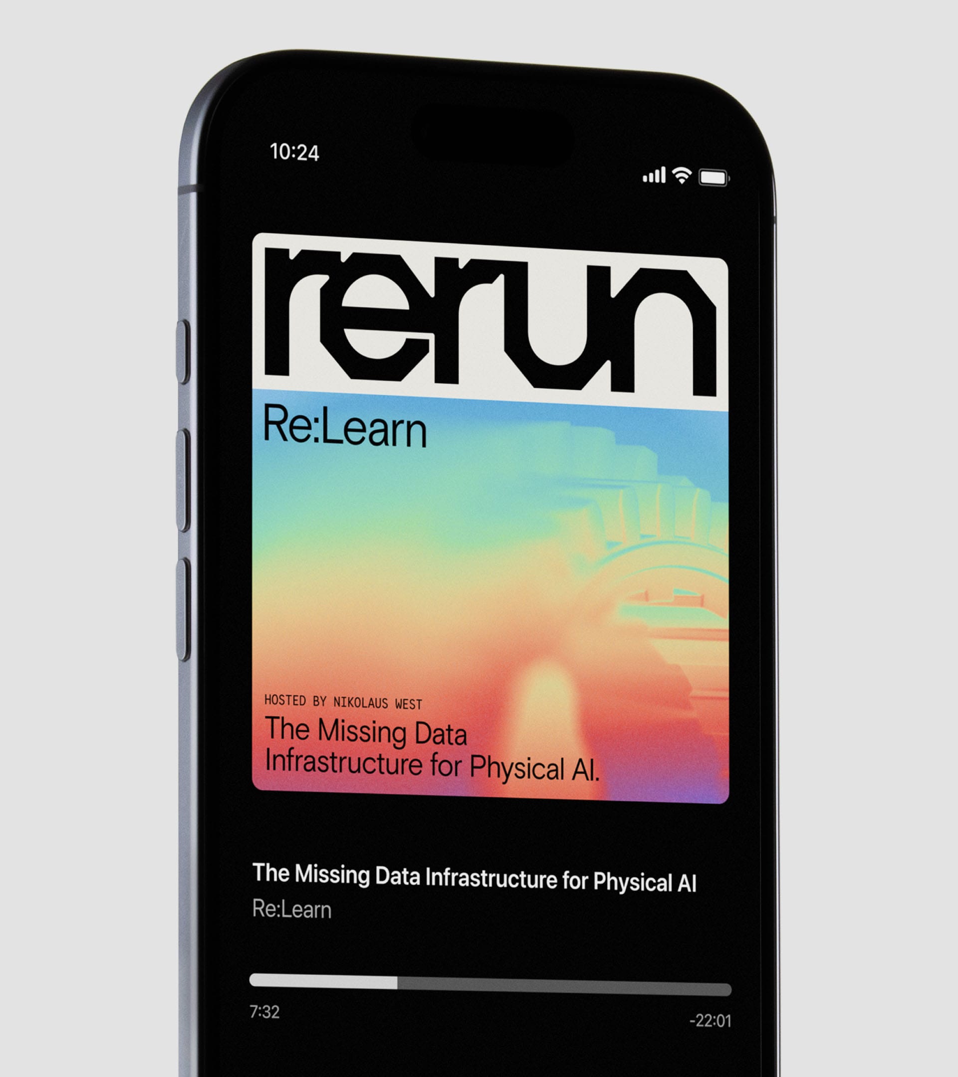
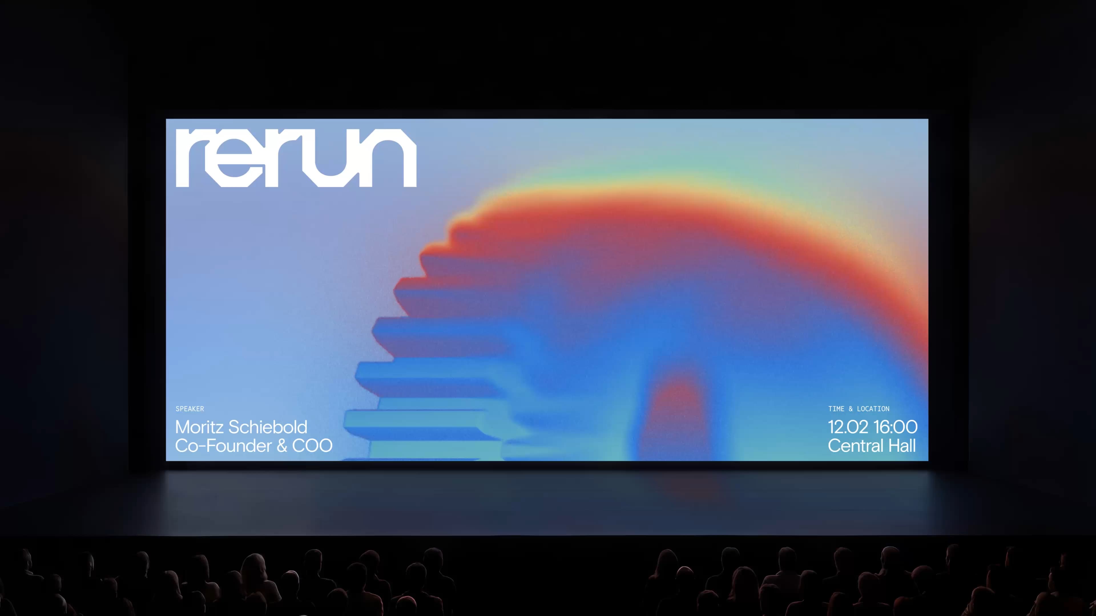
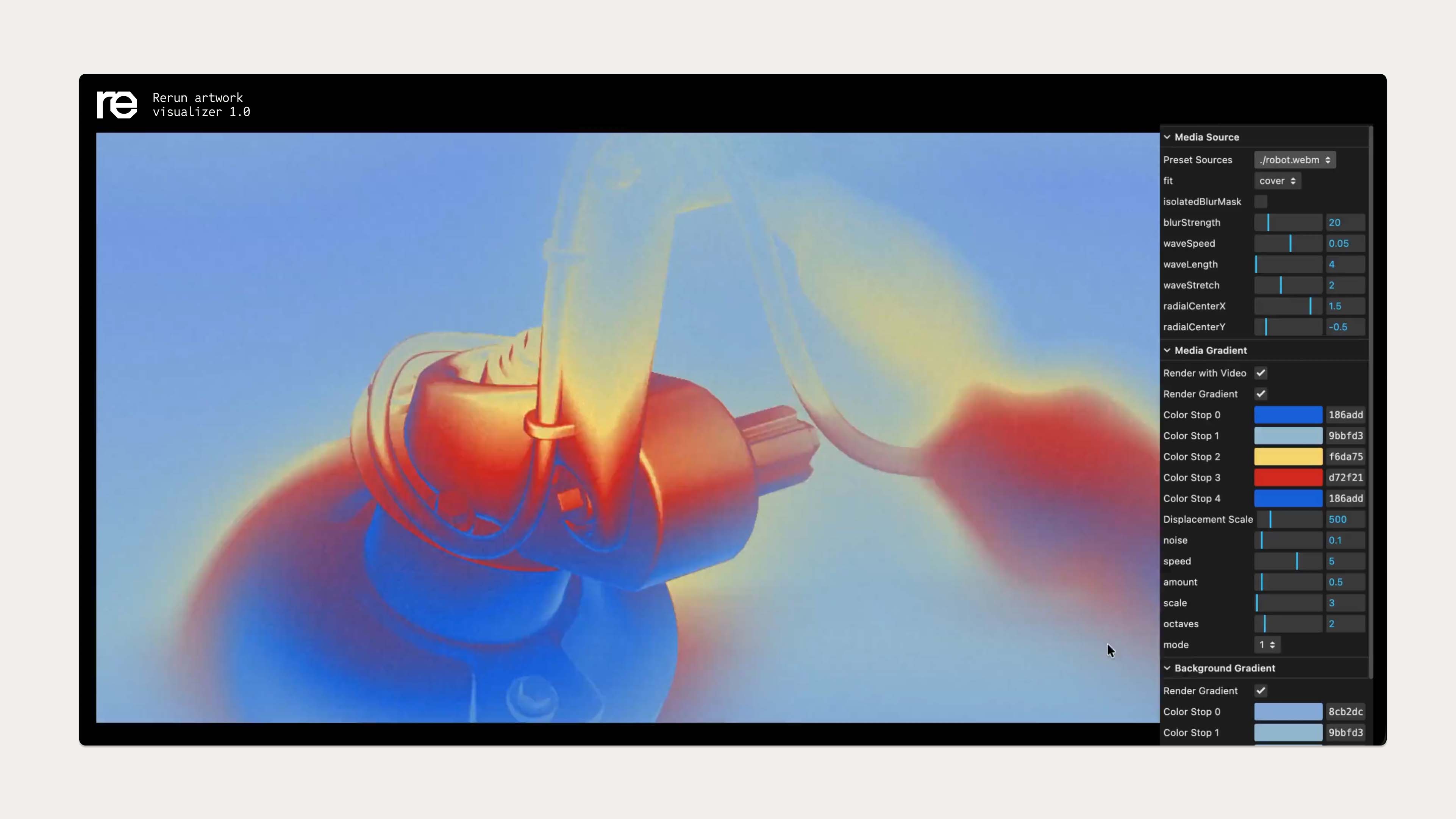
We built a visual brand and digital design system: simplifying a complex product into a clear visual language, while playing with the cues around robotics to land a point of view that reflects the Rerun team.
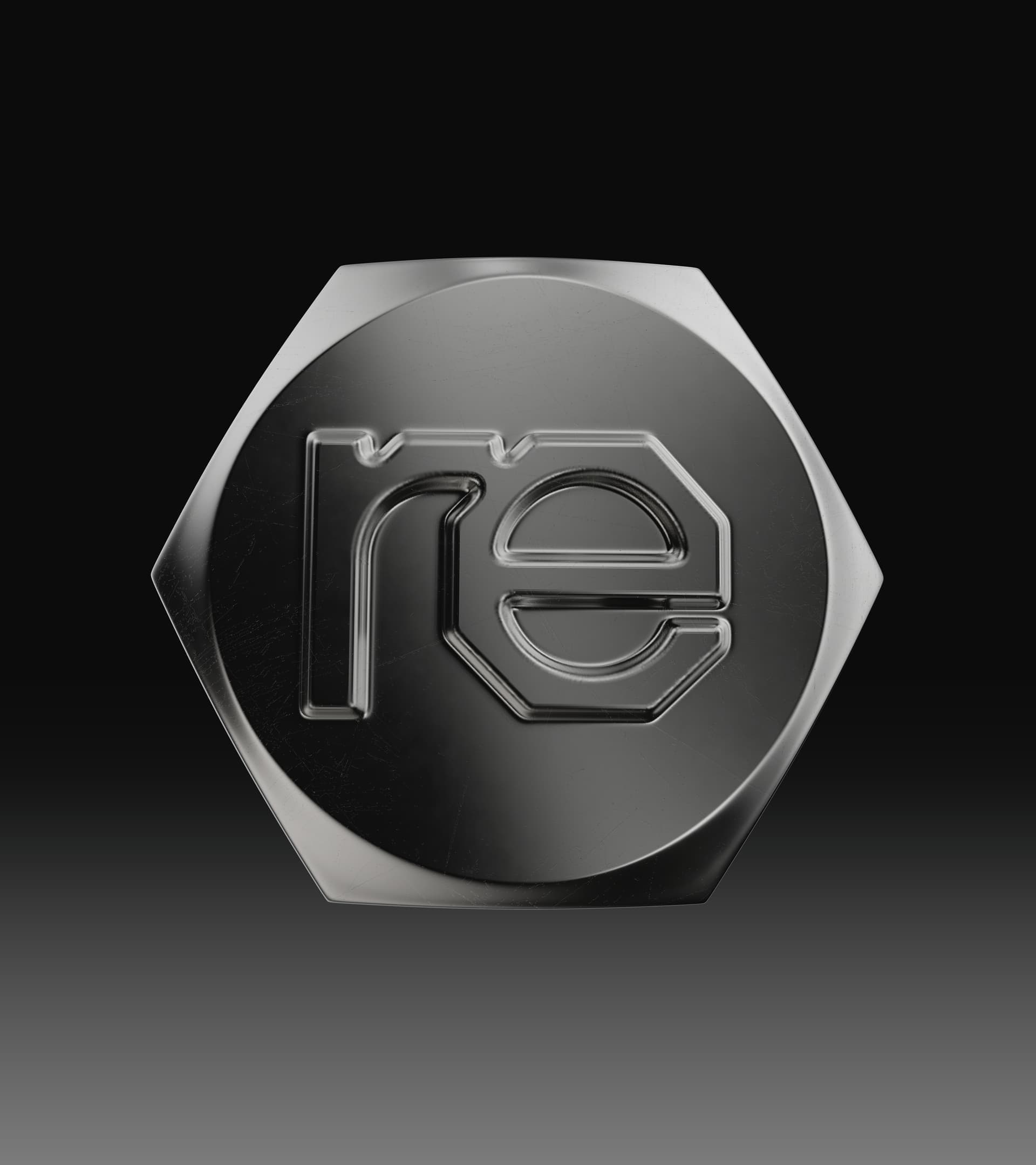
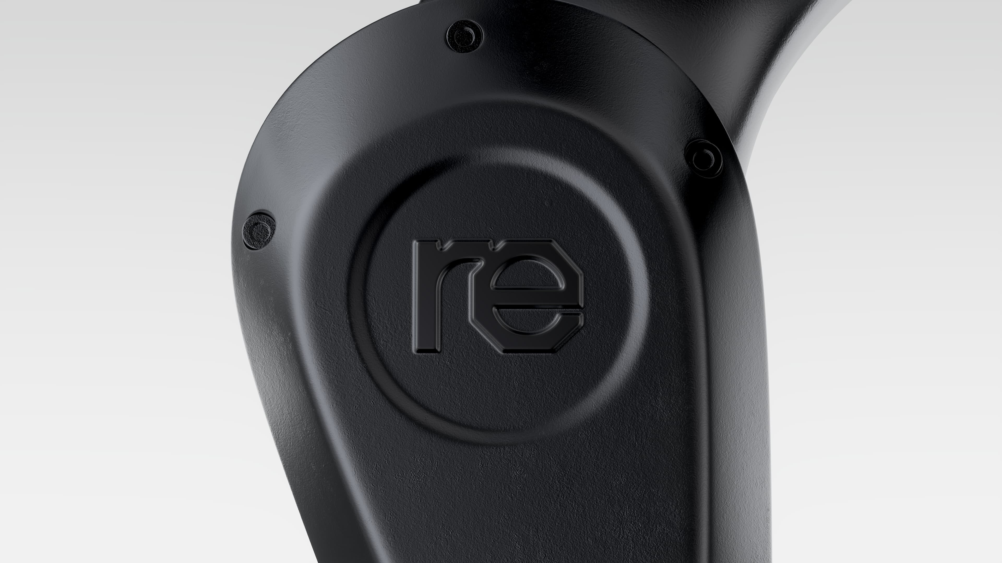
People picture robotics as clinical and cold. The reality is grittier: bolts, soldering irons, melted chips, a workshop more than a lab. Instead of another cold space, we leaned into the human story. Most developers build from the same emotion as any other creator, so the brand had to hold both sides: hard and analytical when it needs to be, soft and human everywhere else.
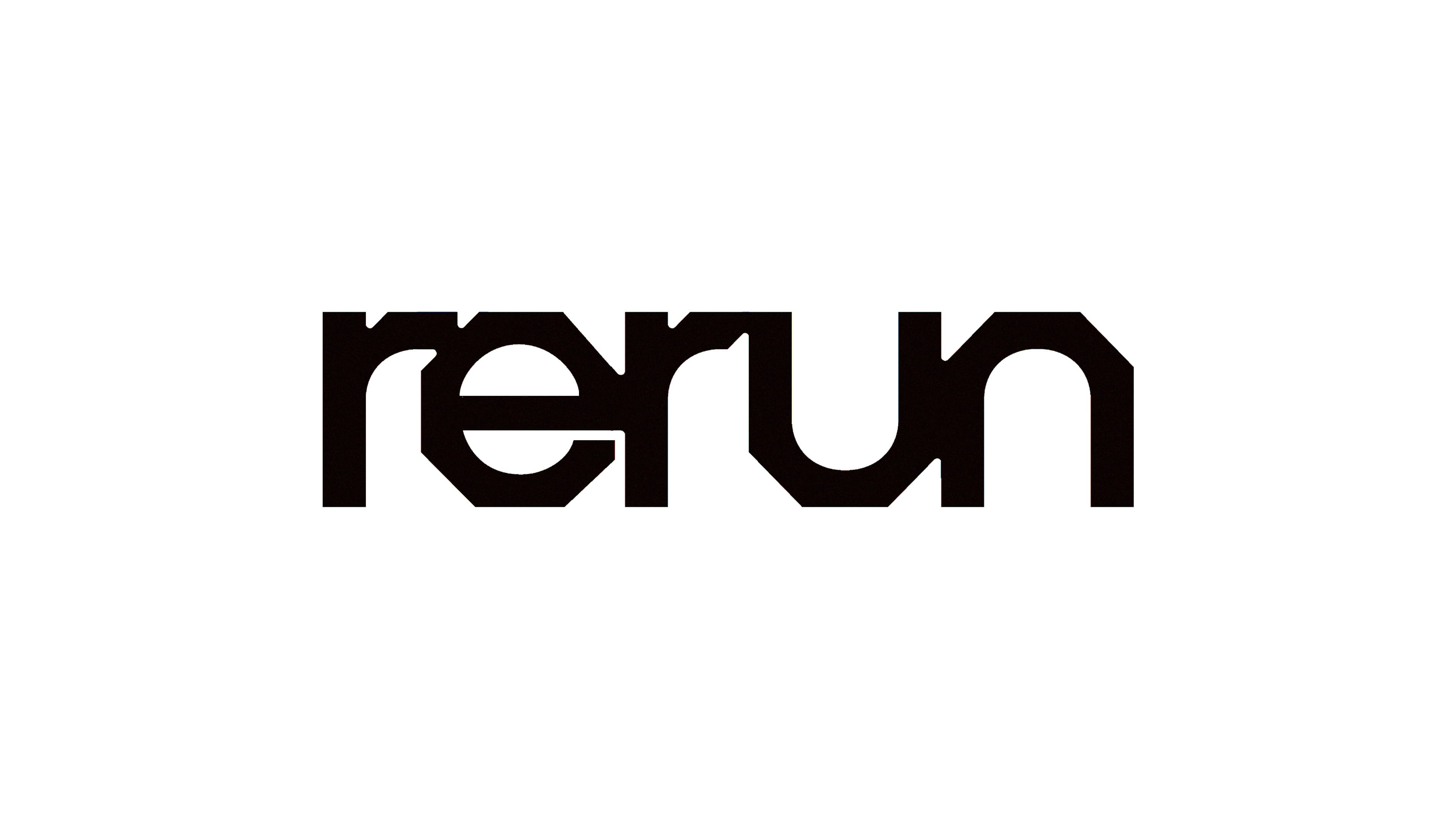
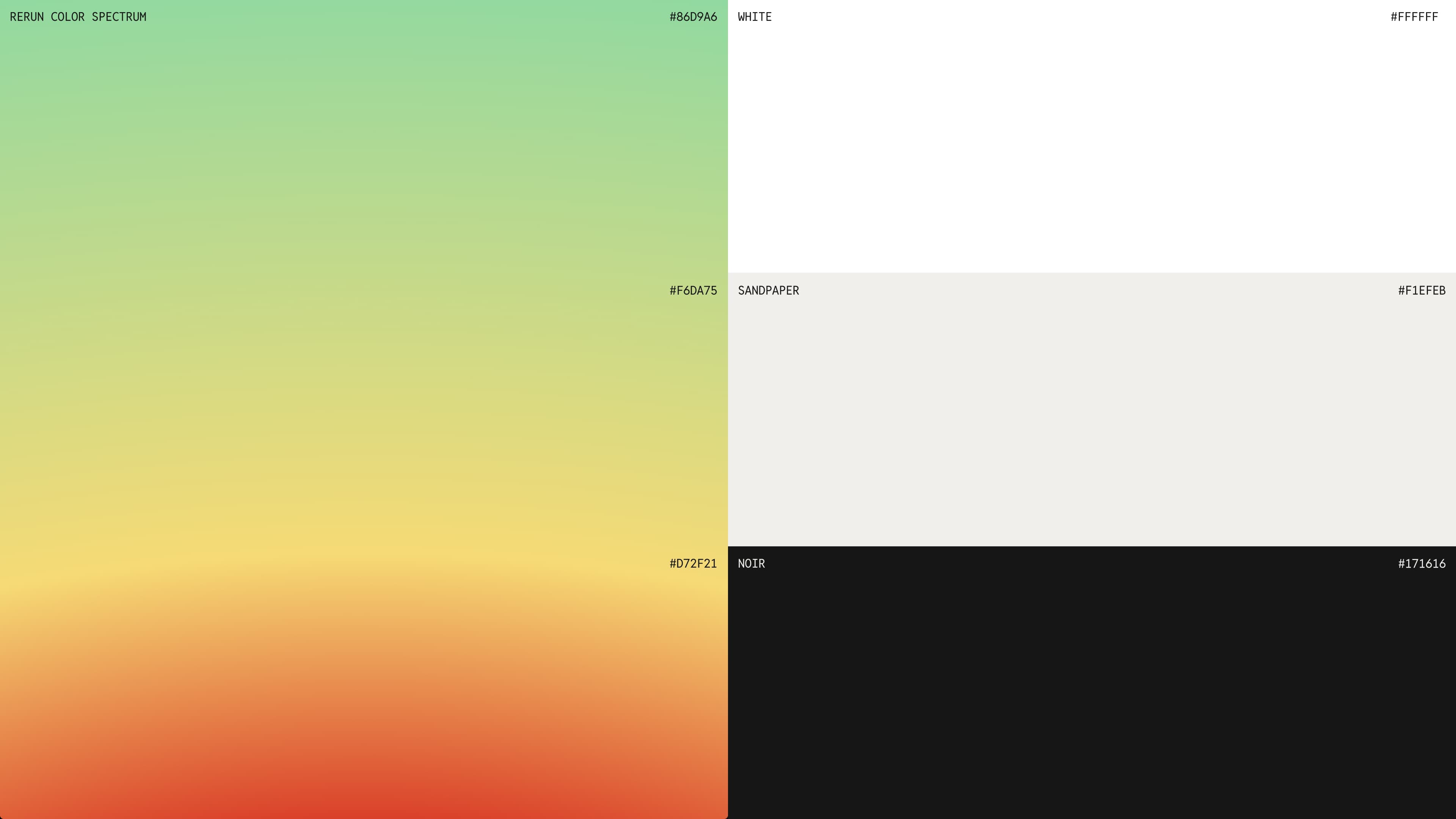
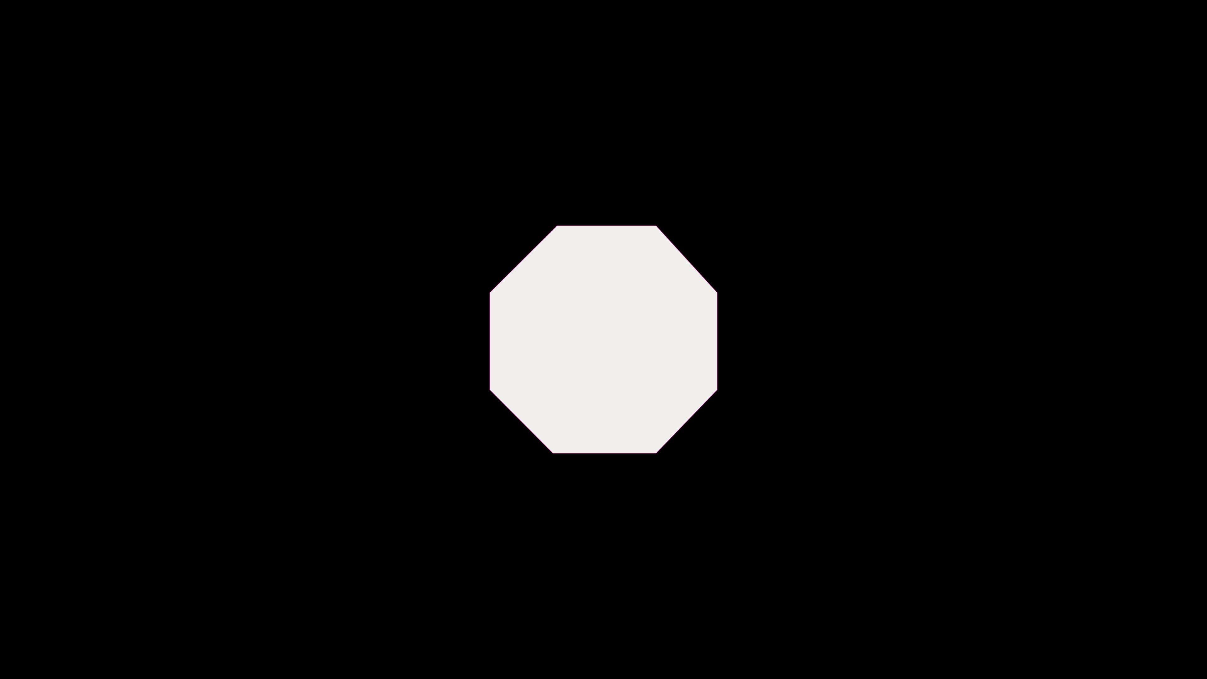
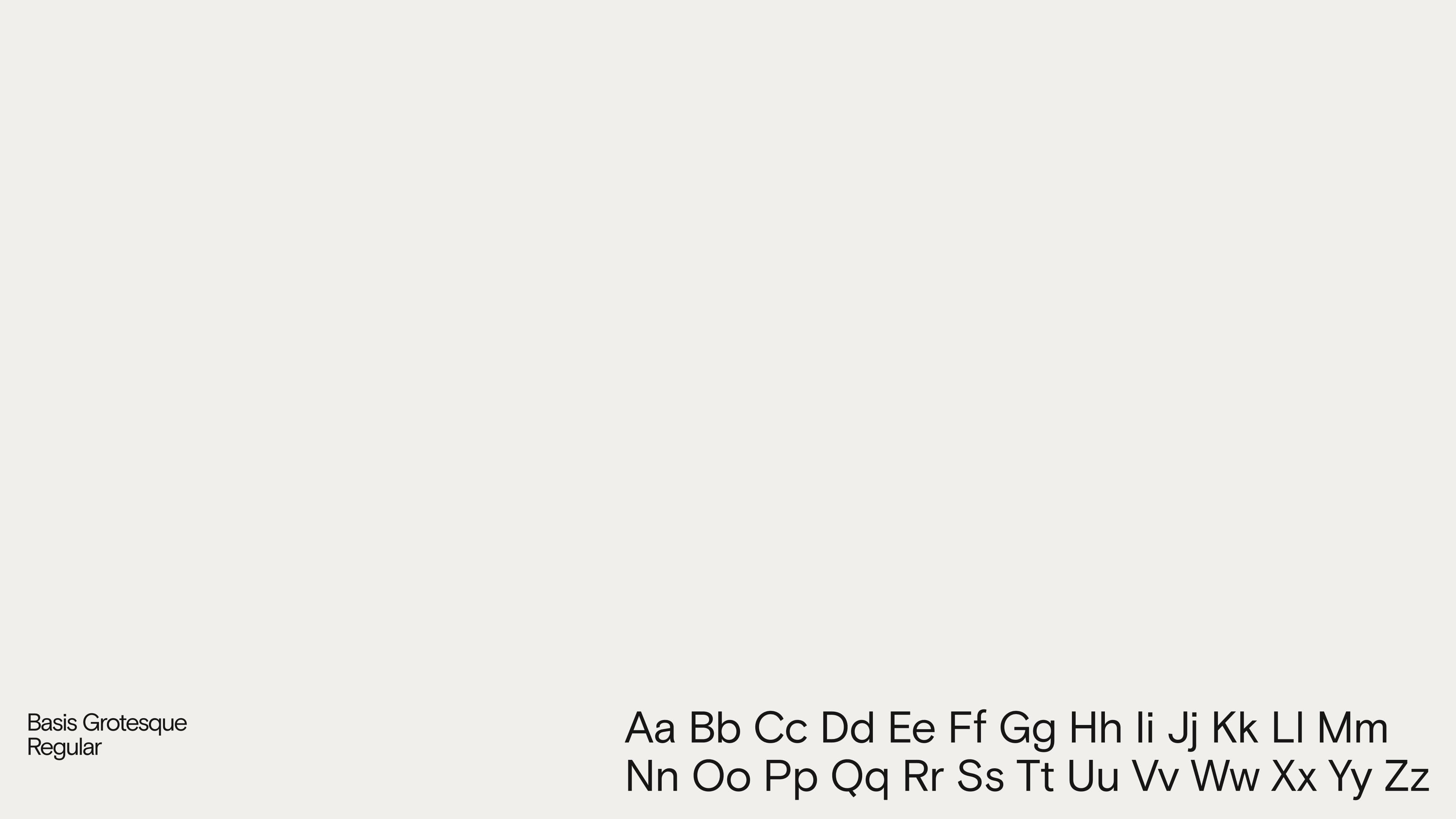
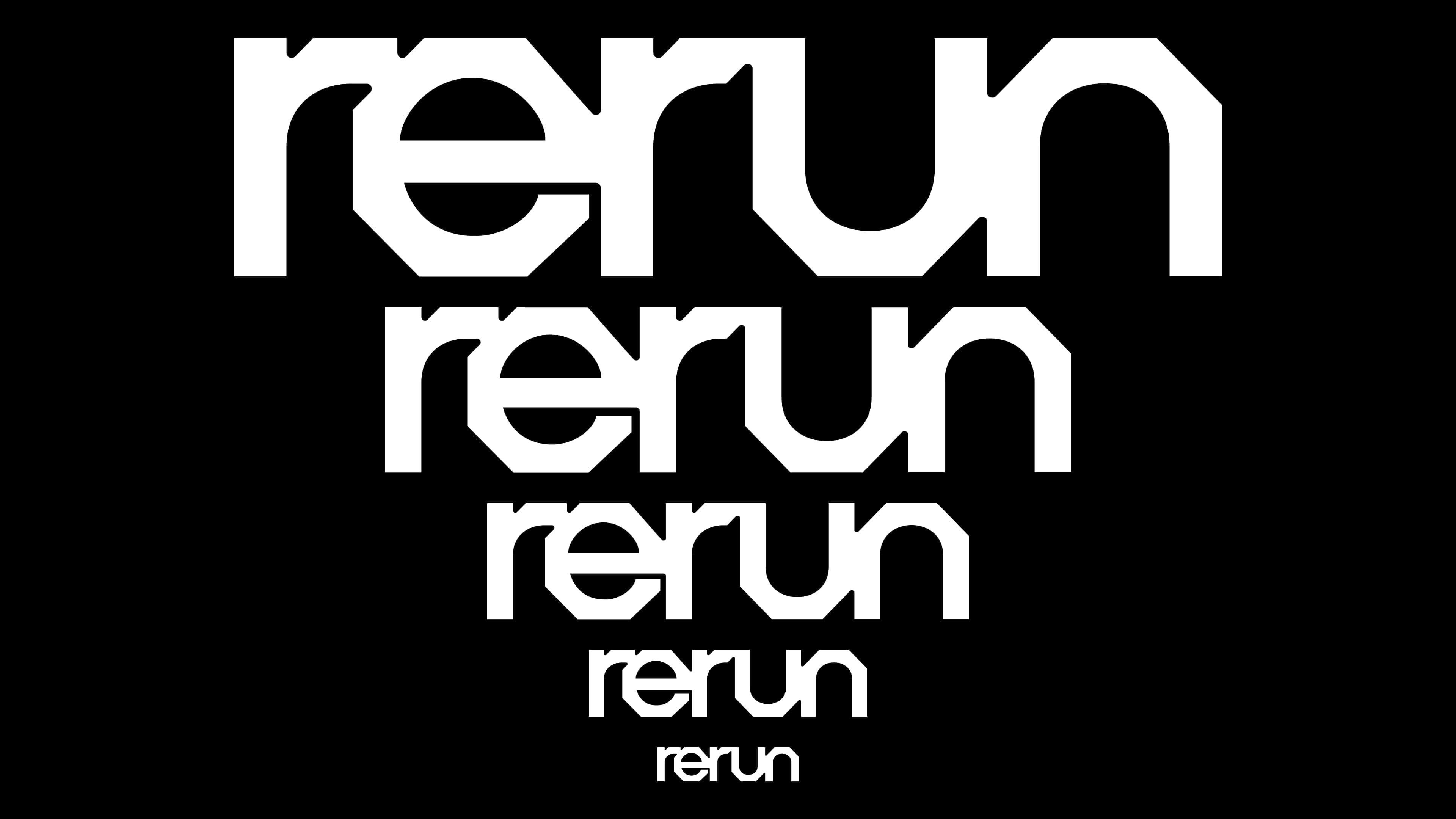
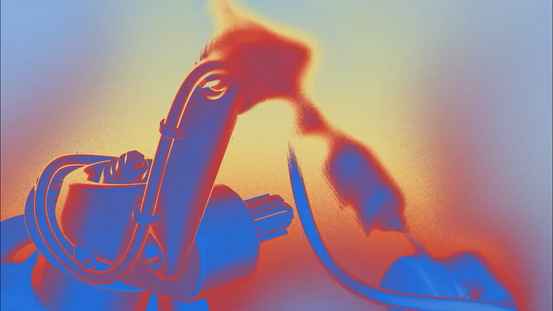
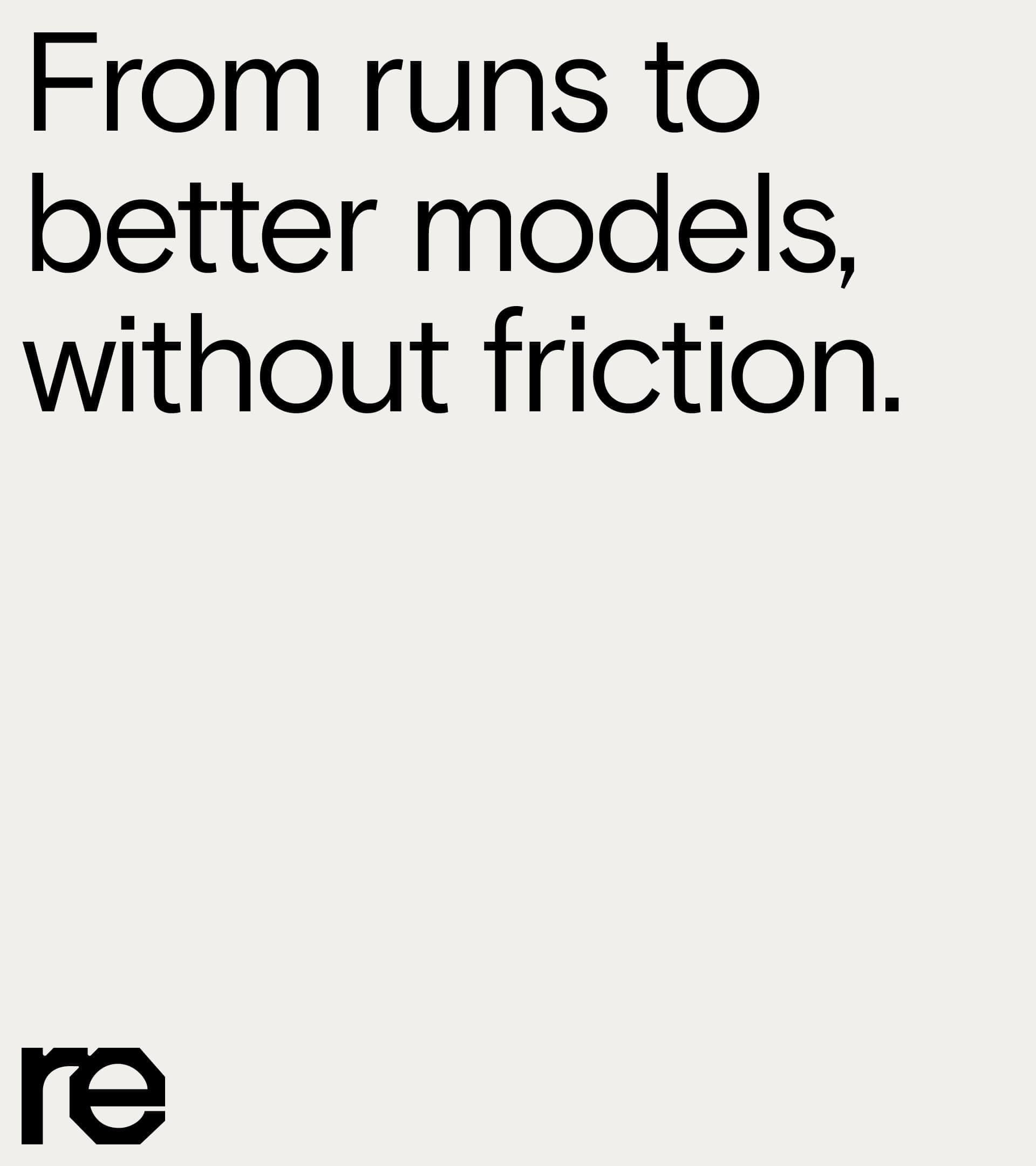
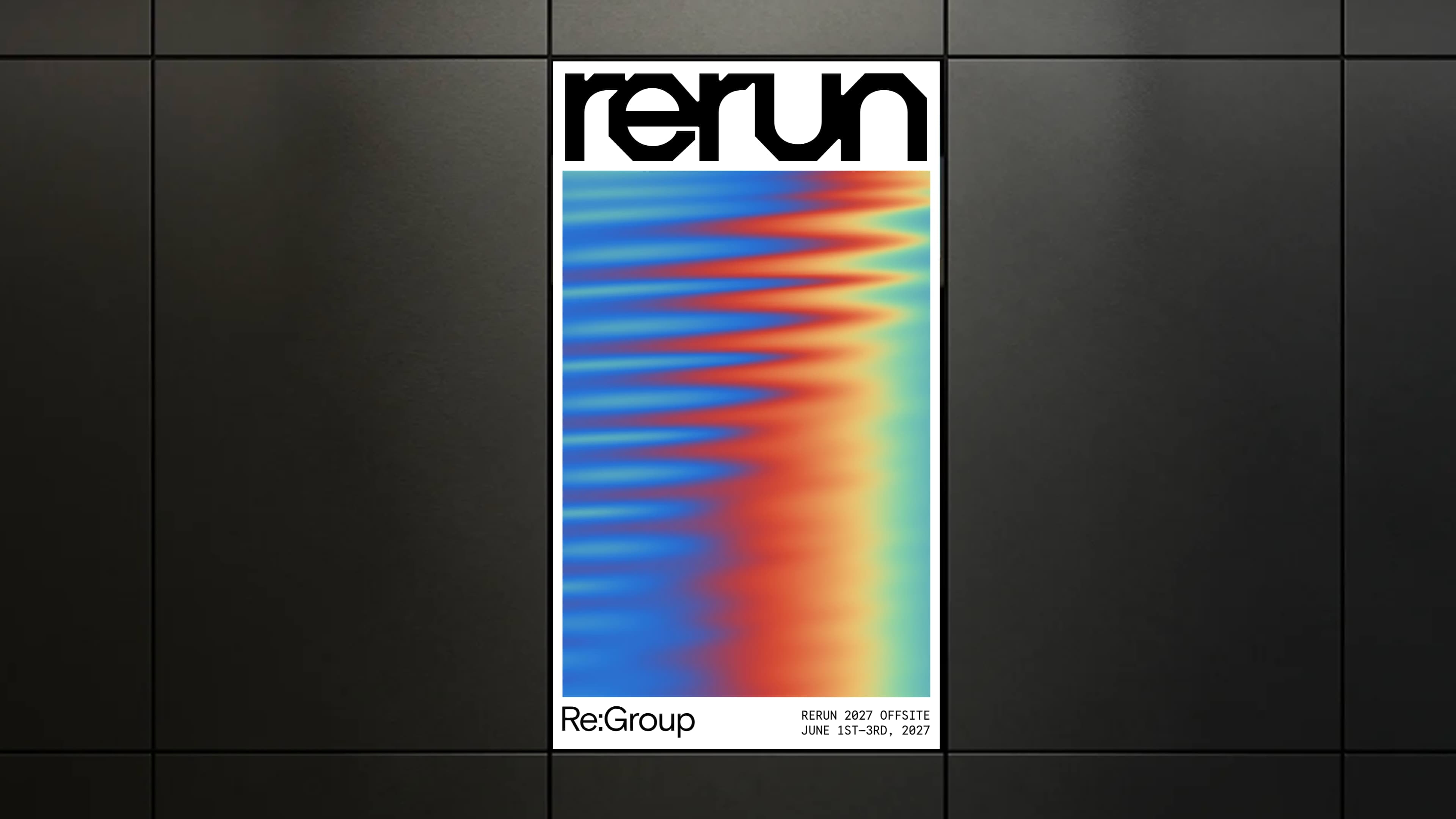
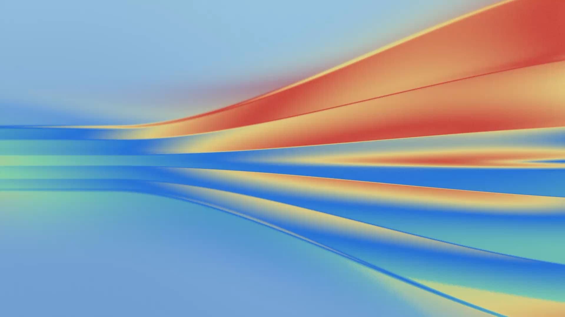
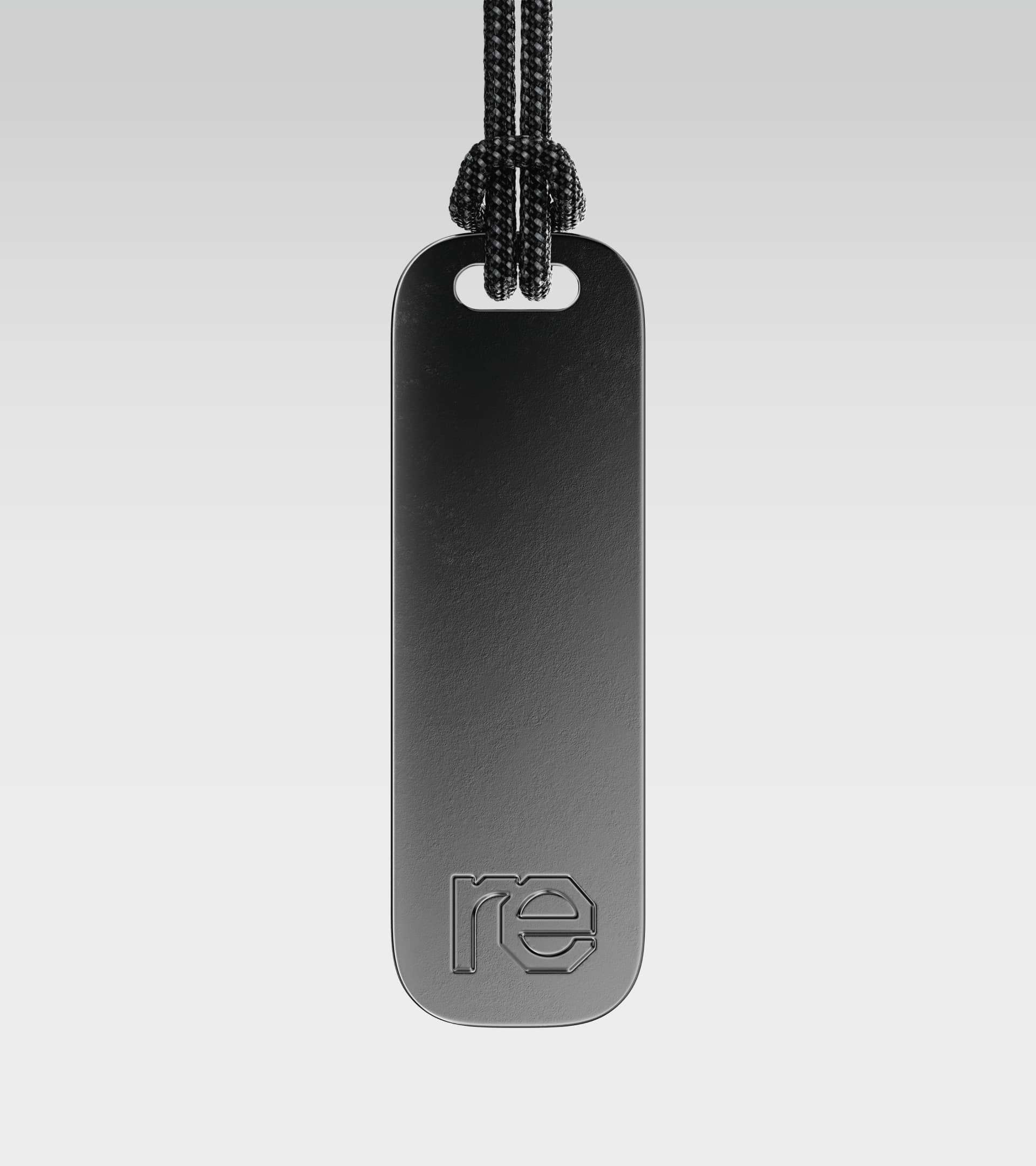
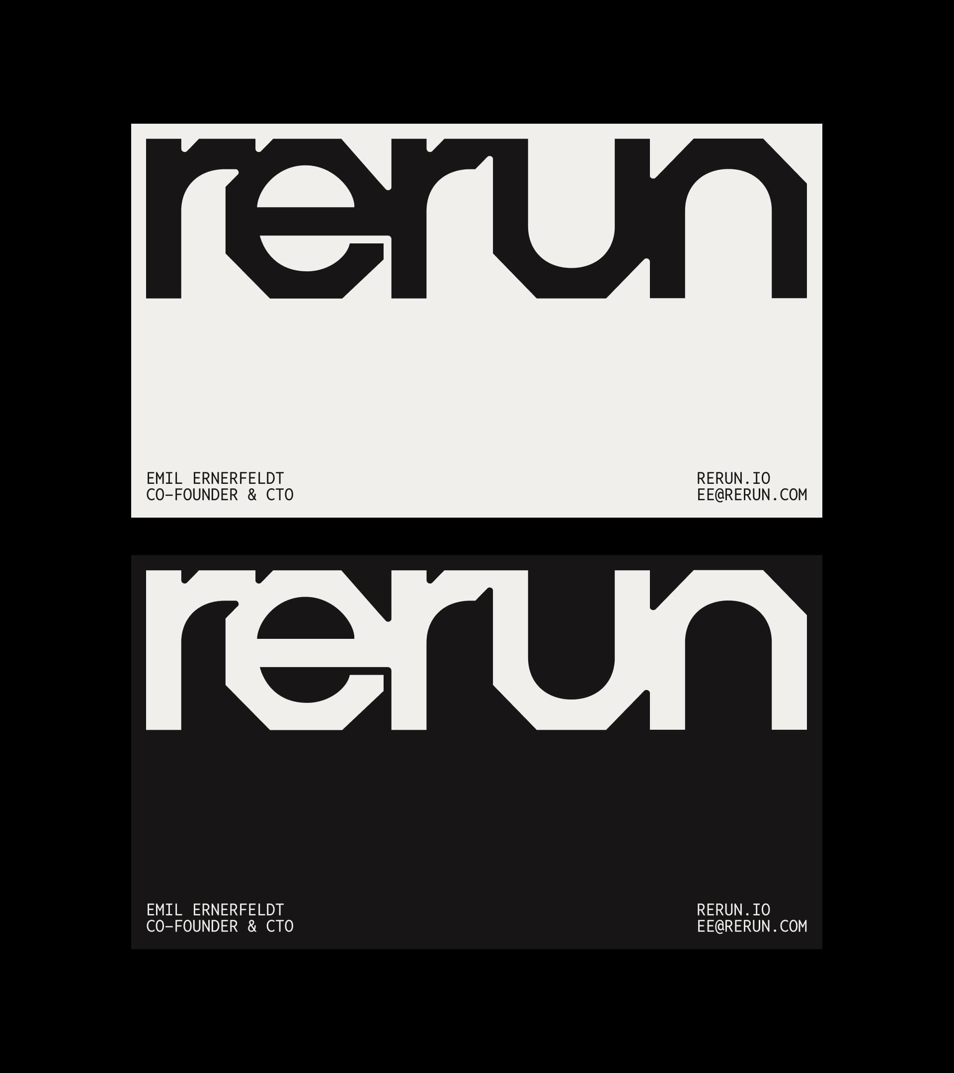
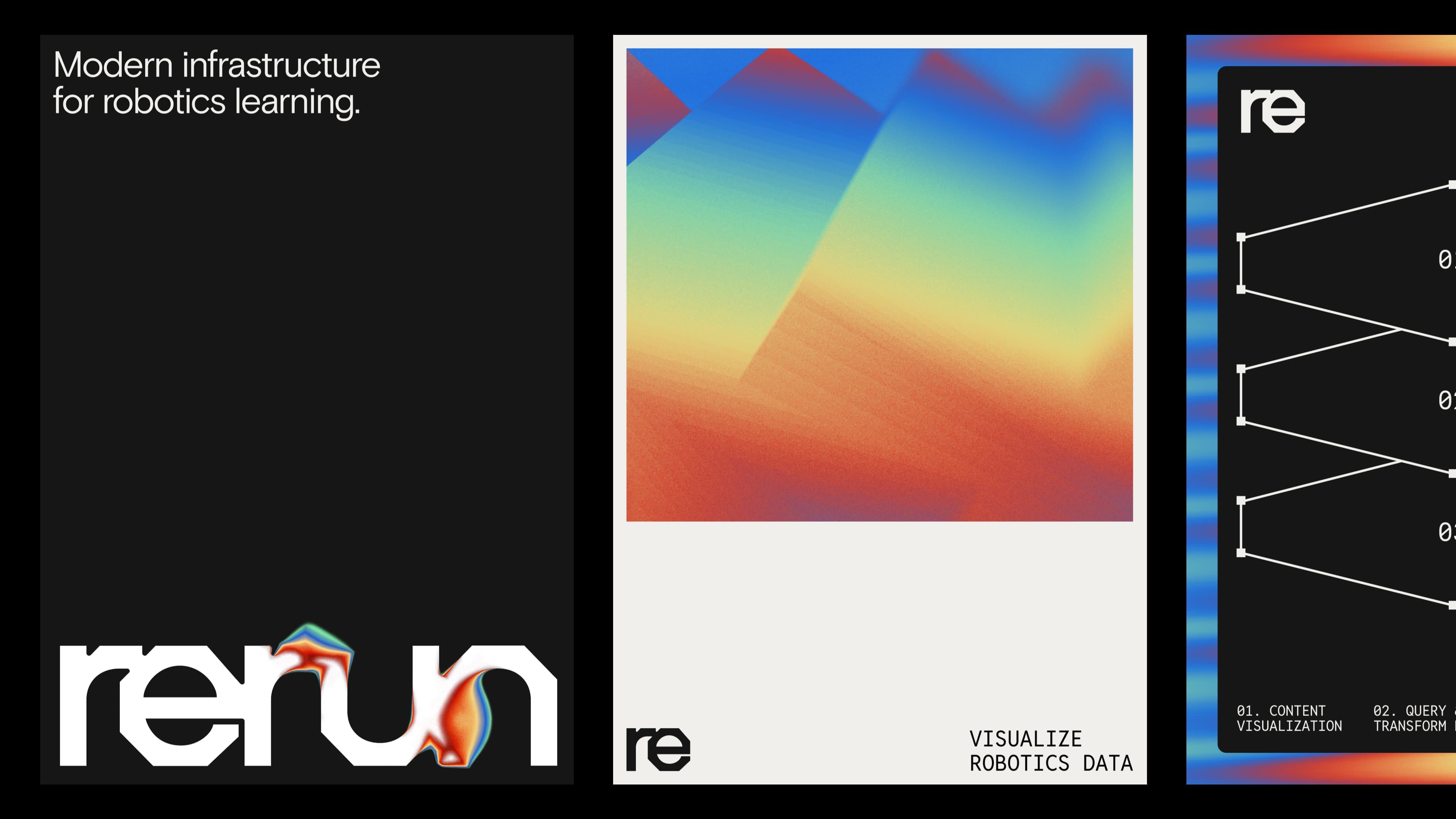
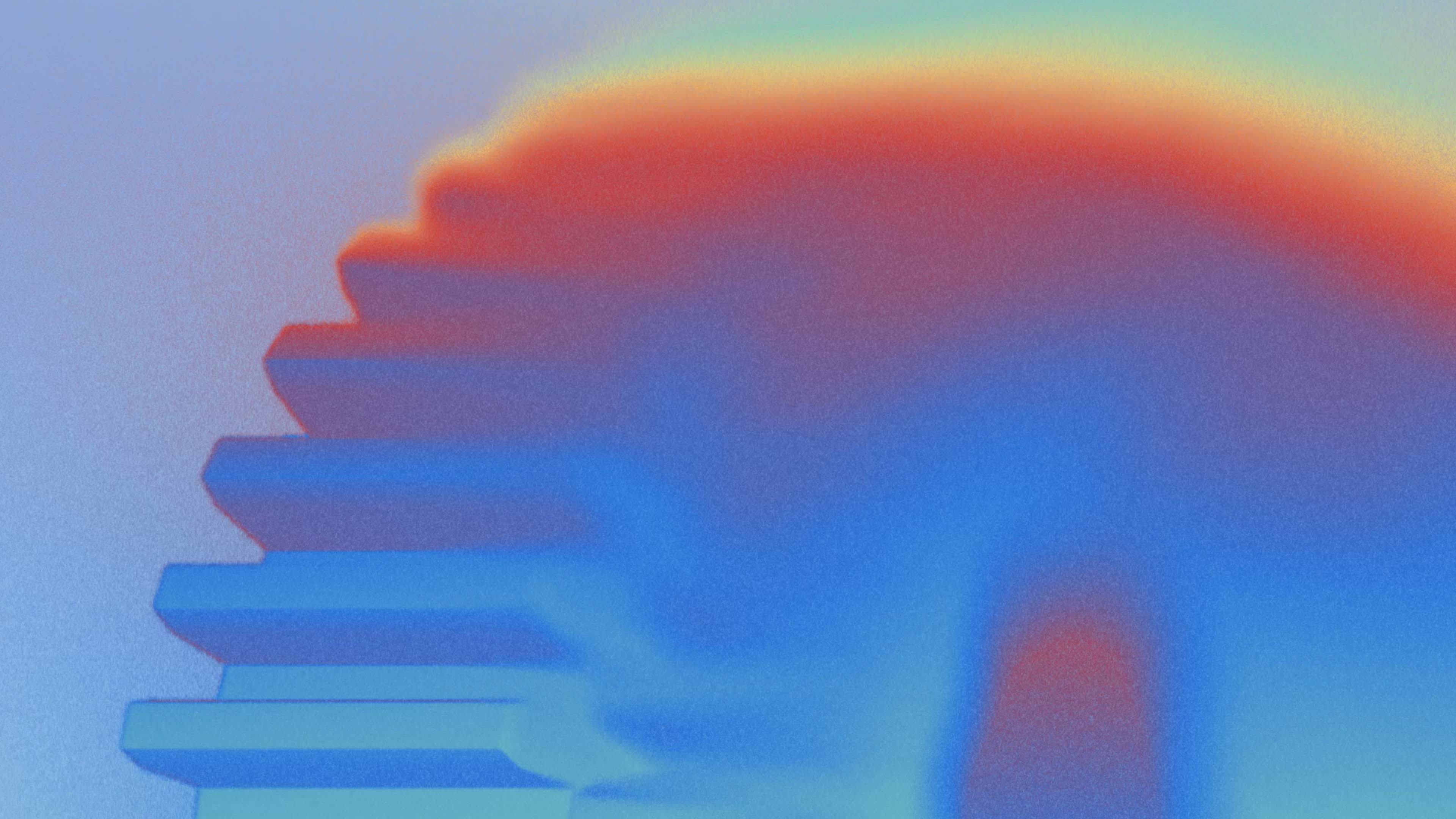
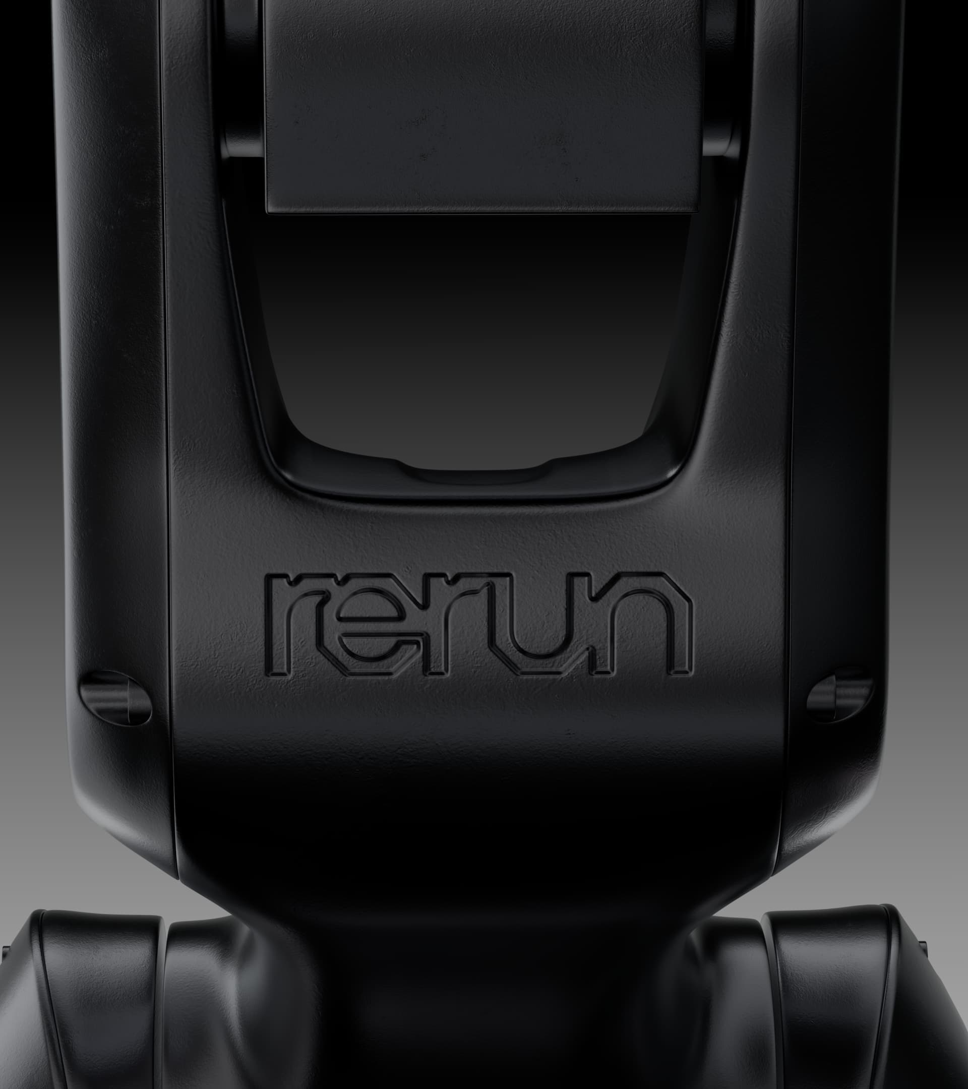
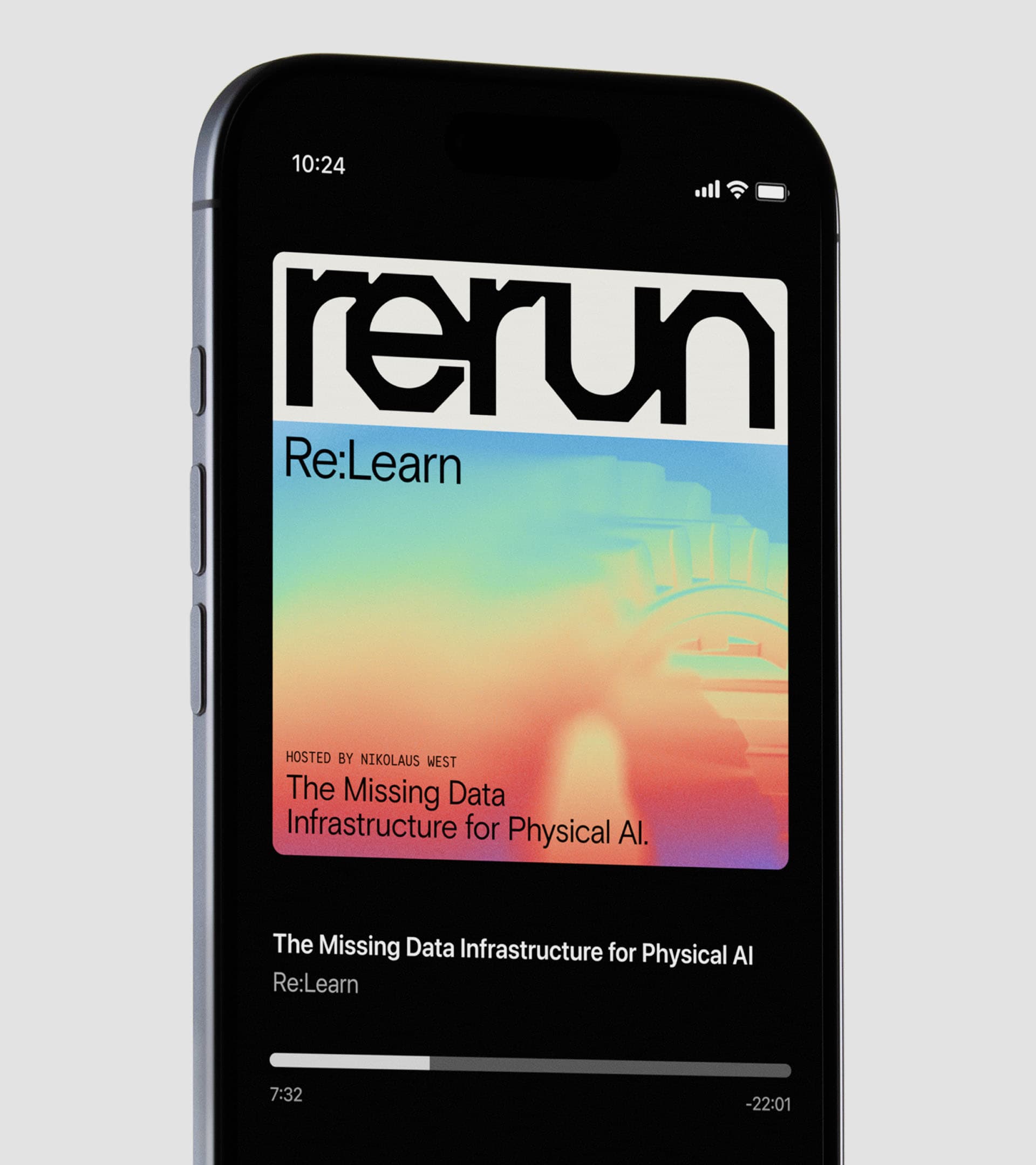
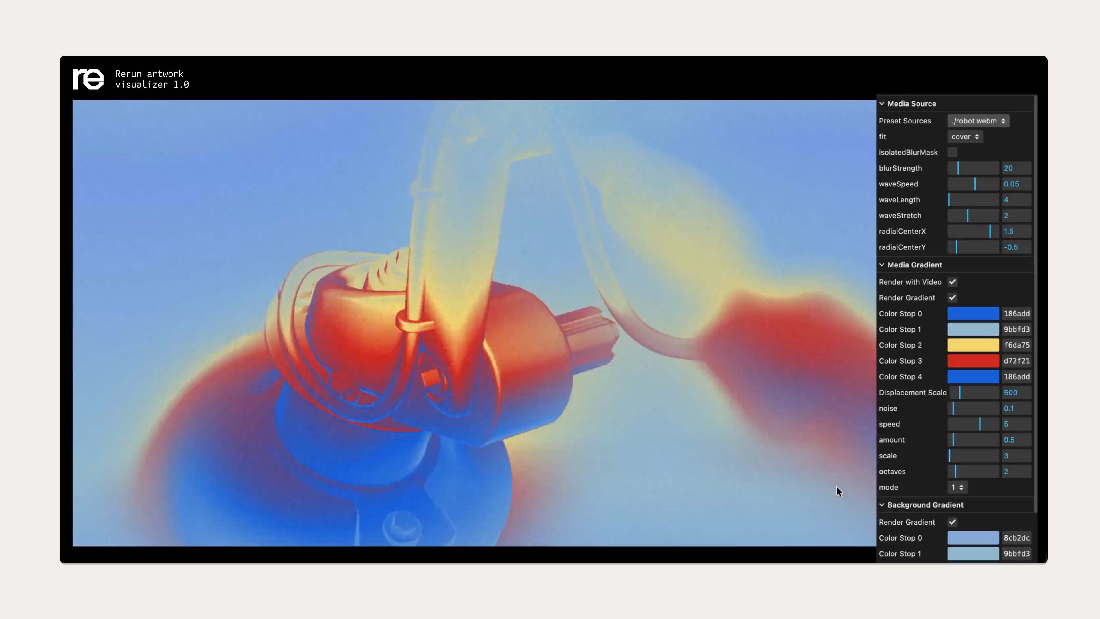
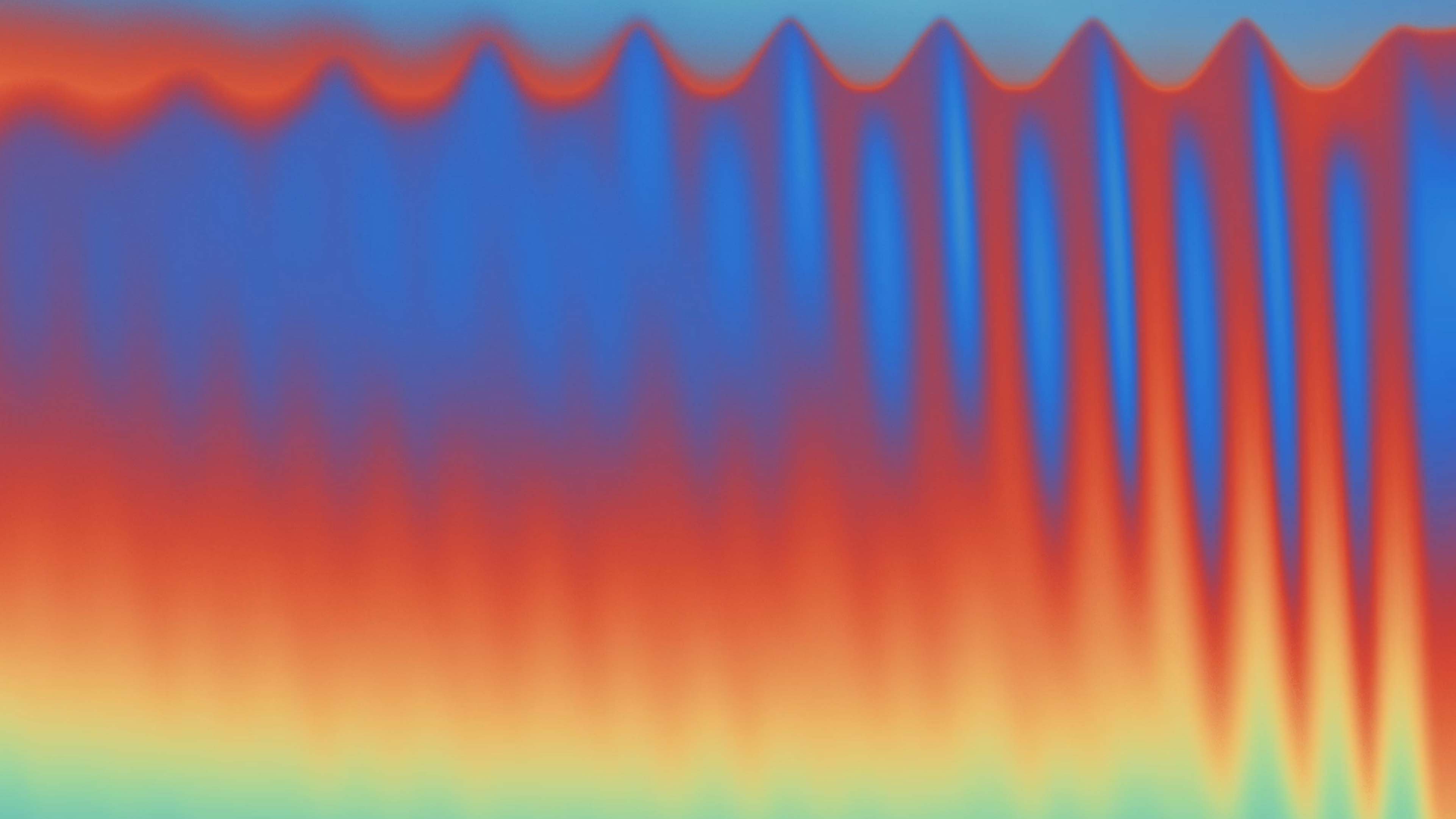
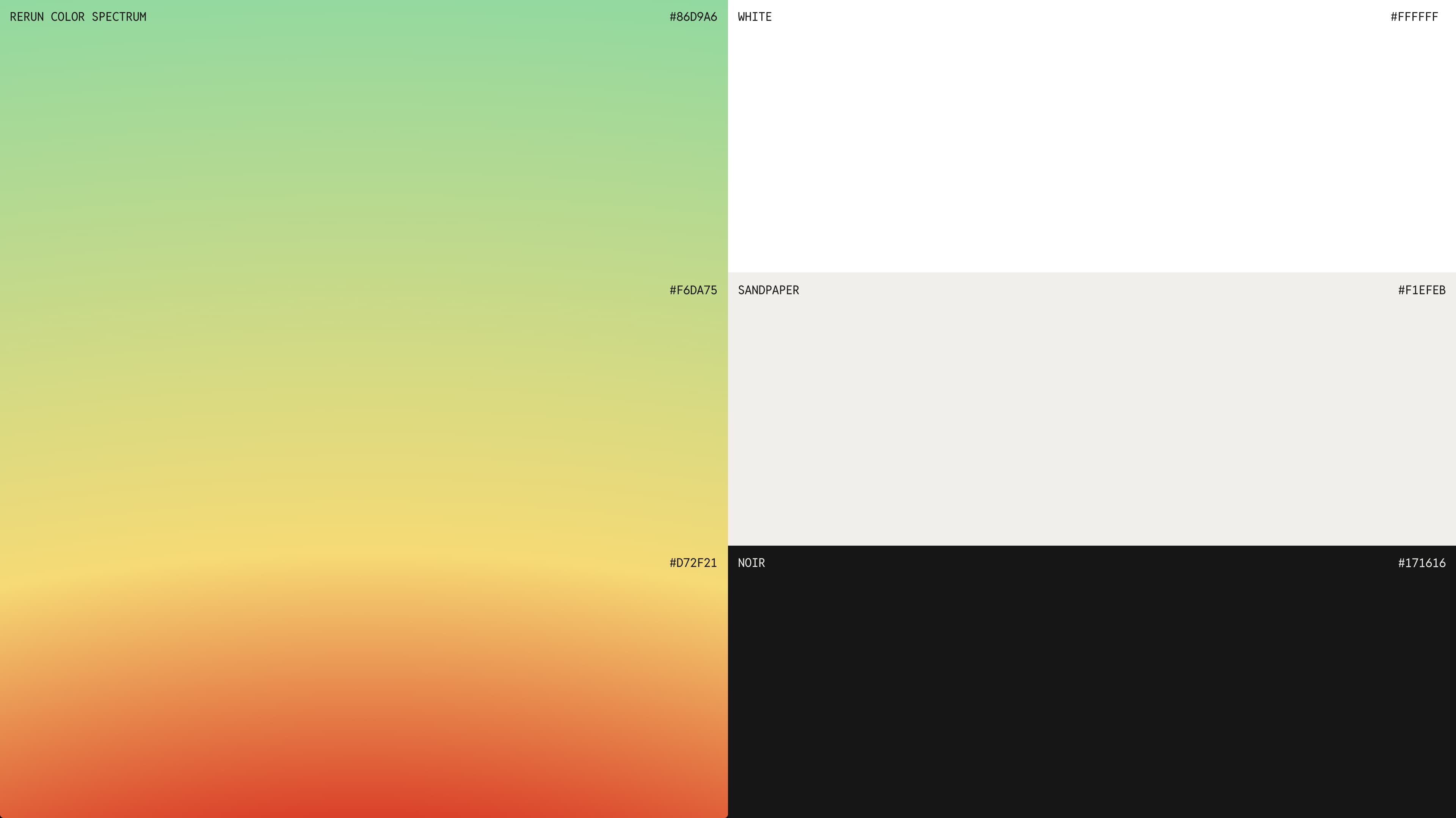
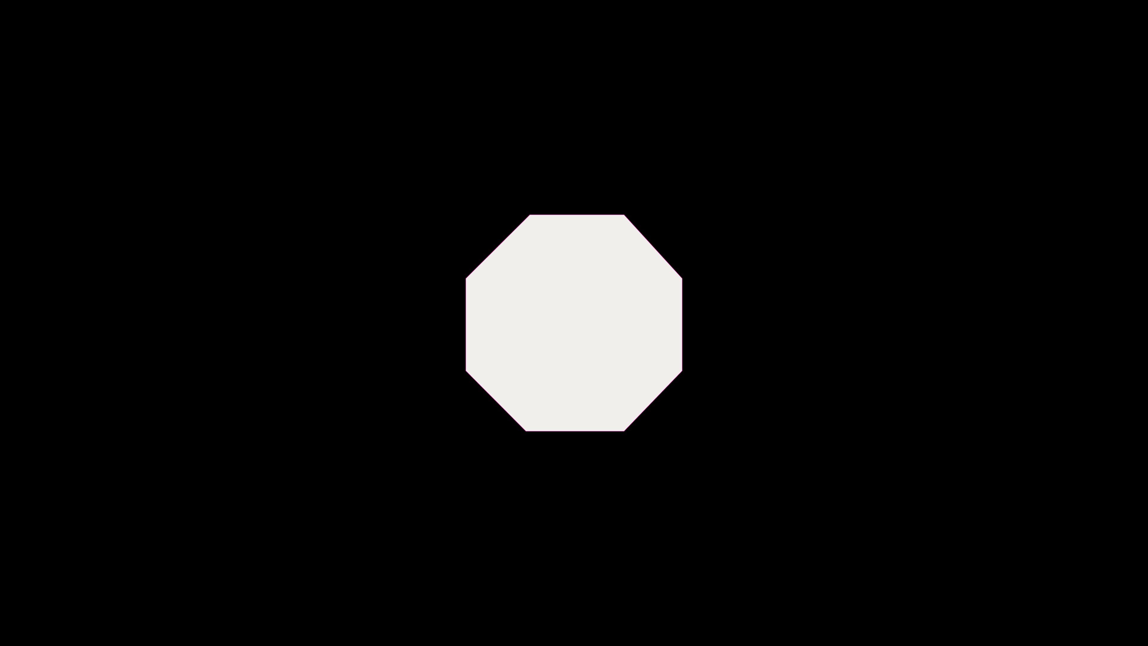
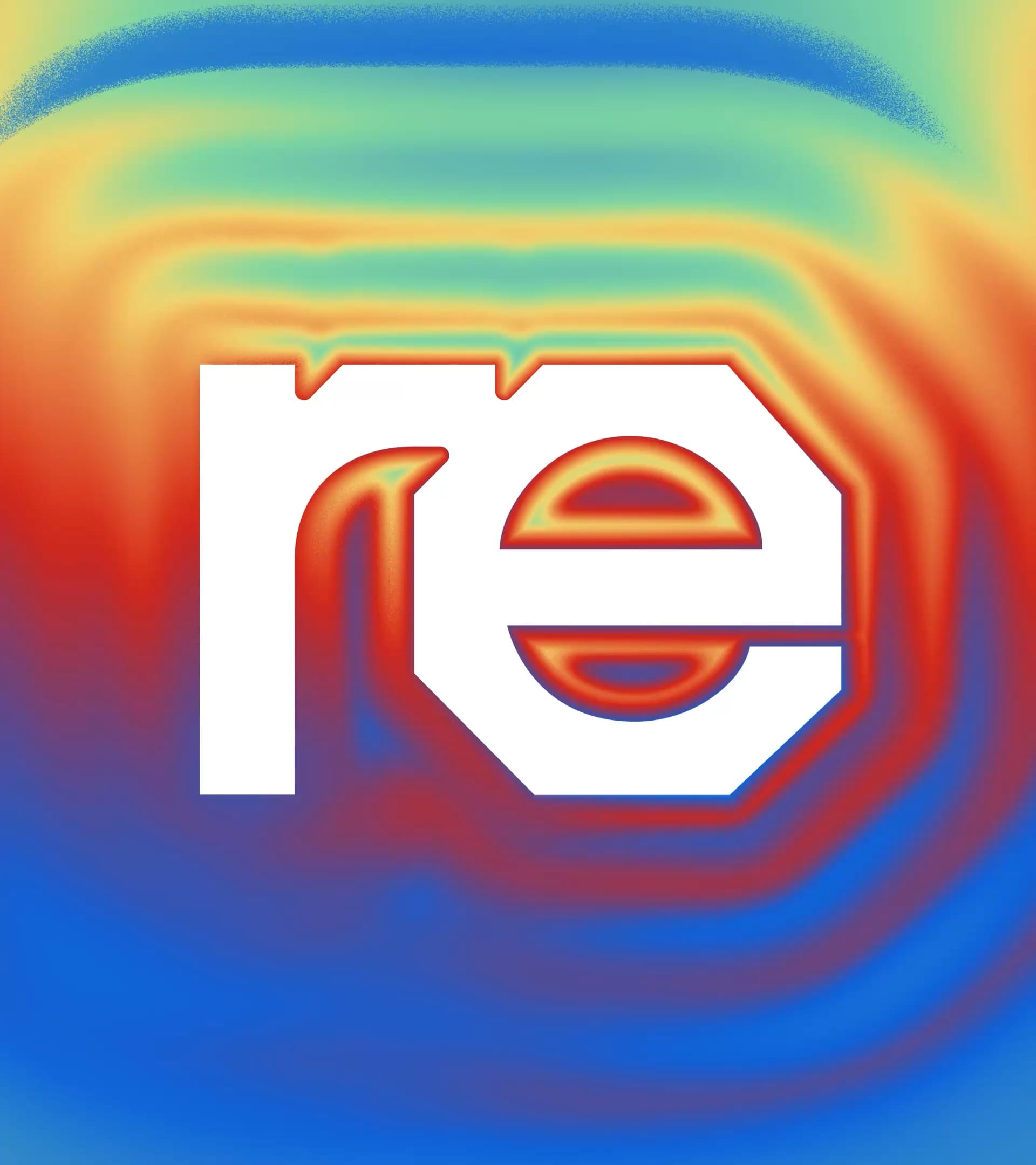
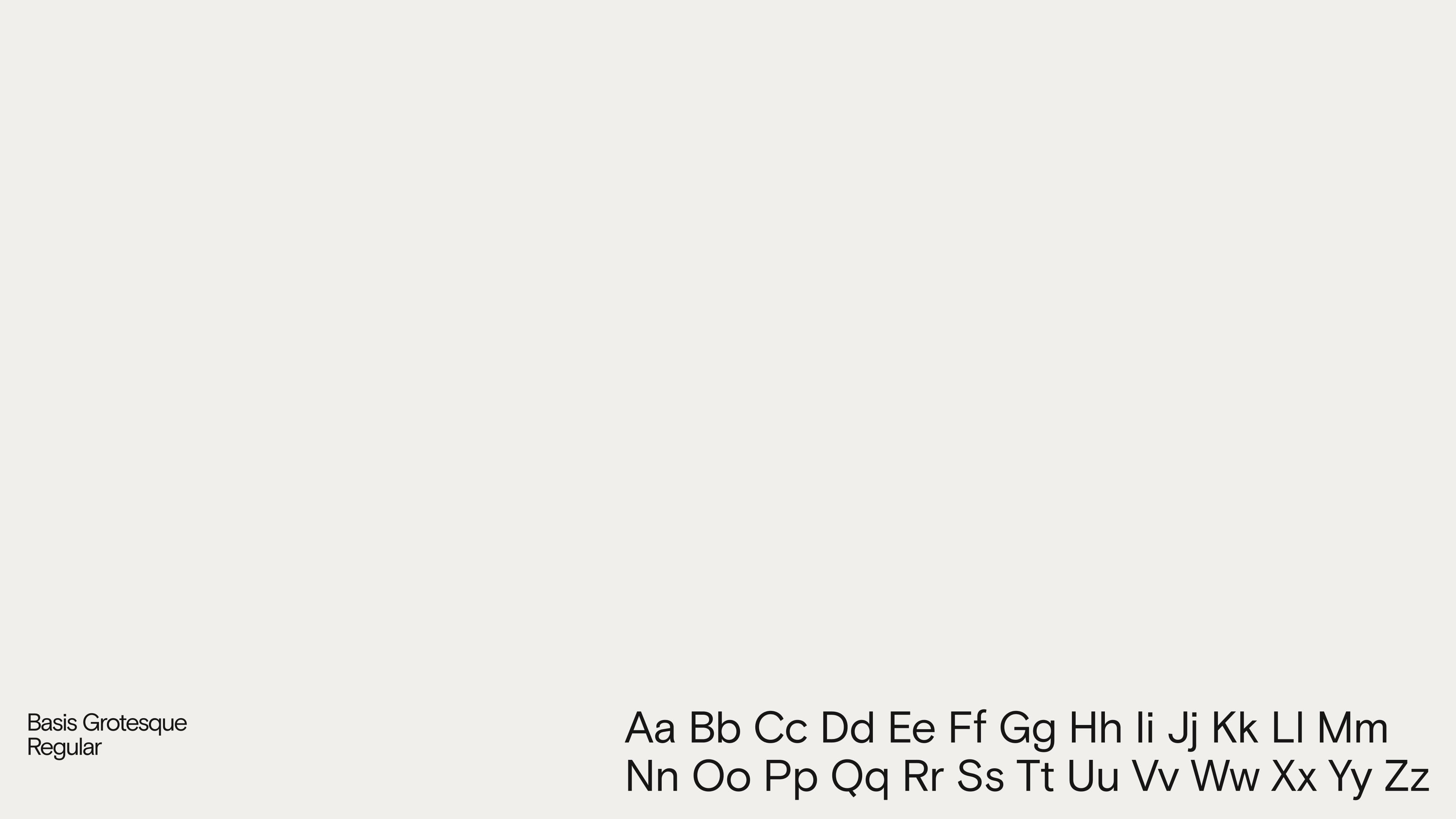
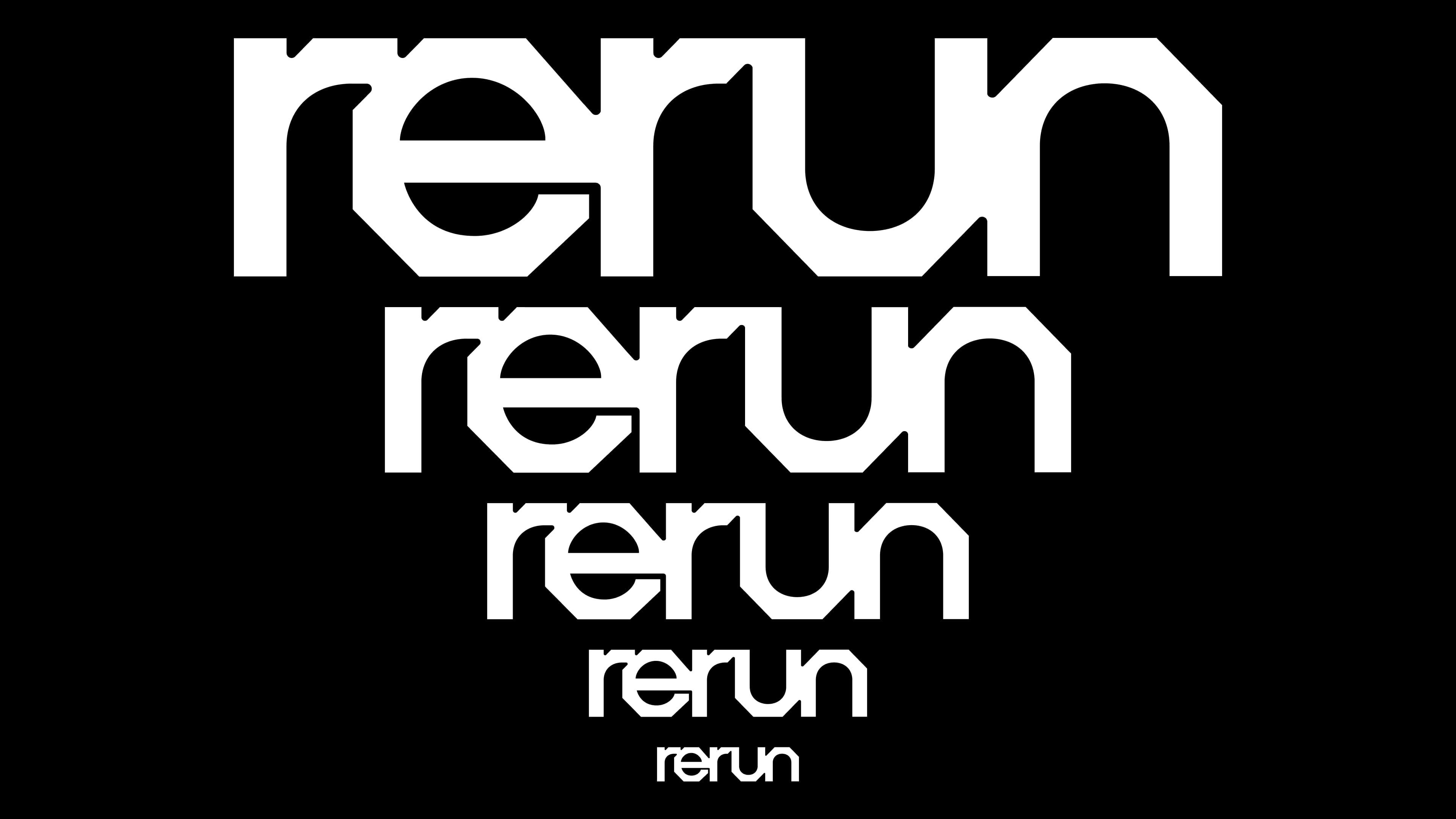
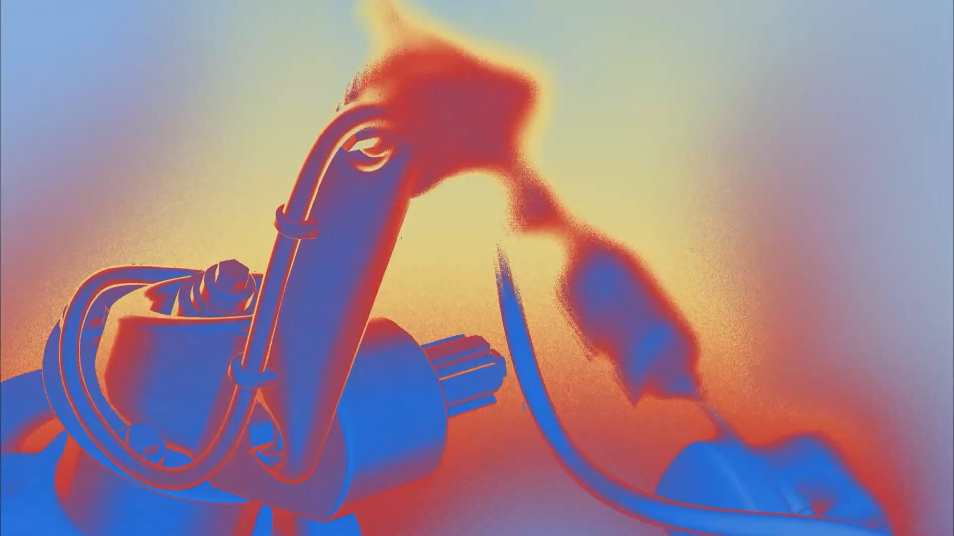
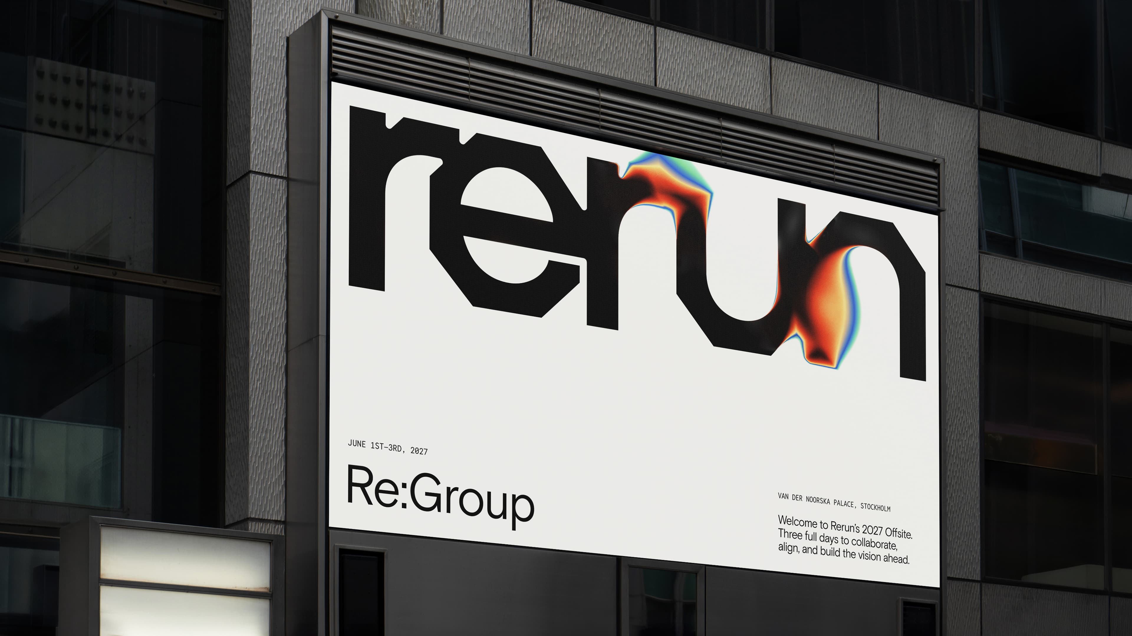
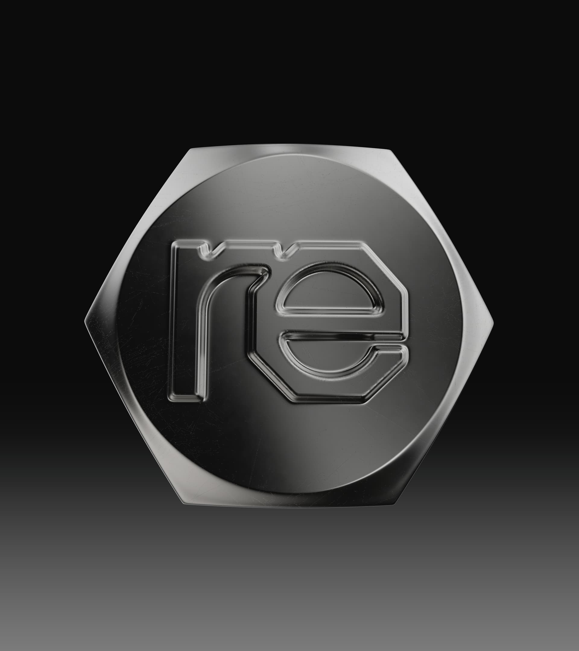
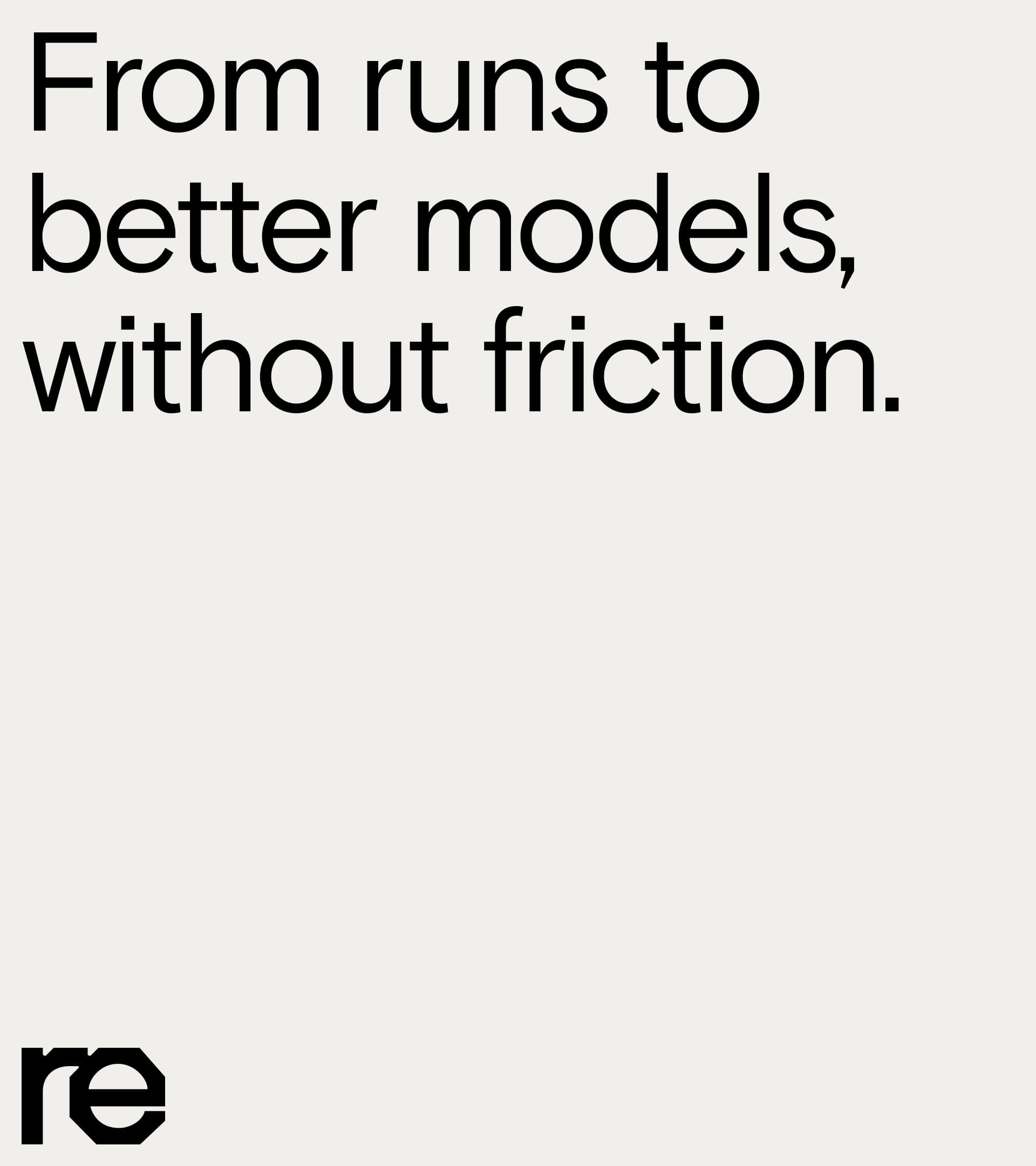
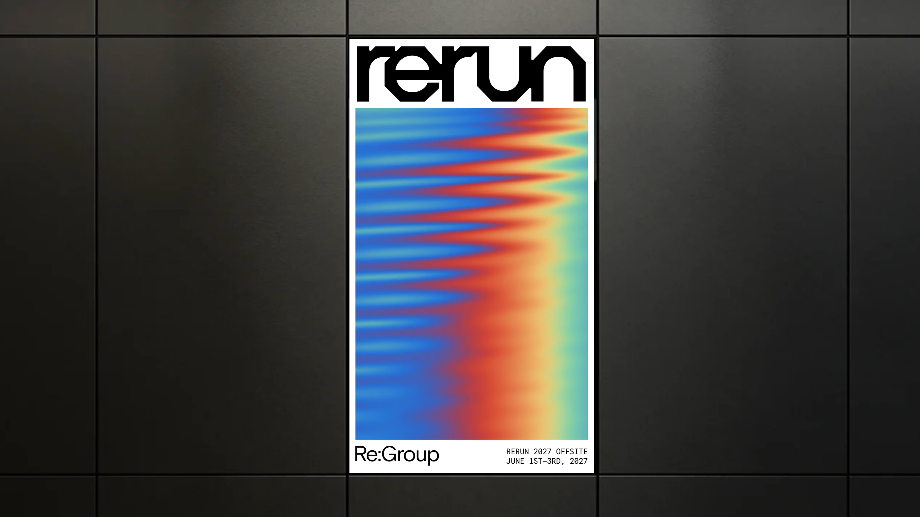
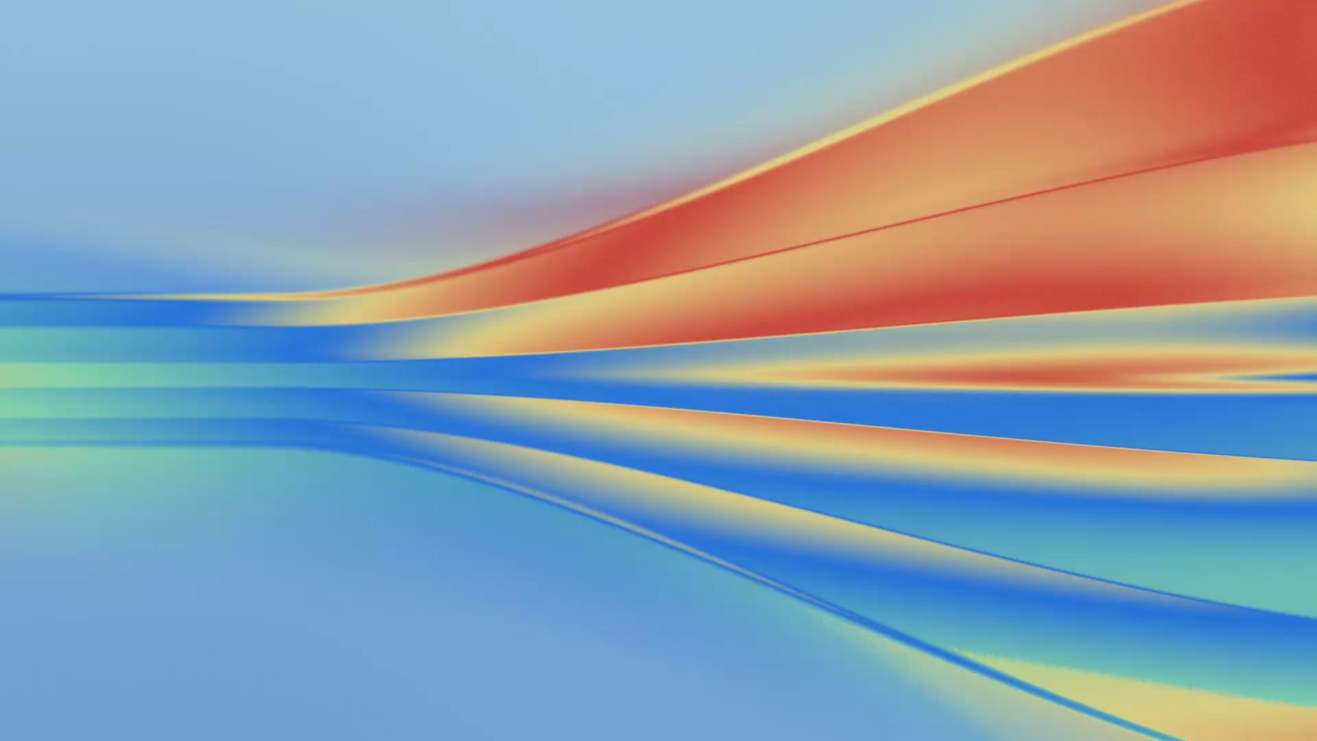
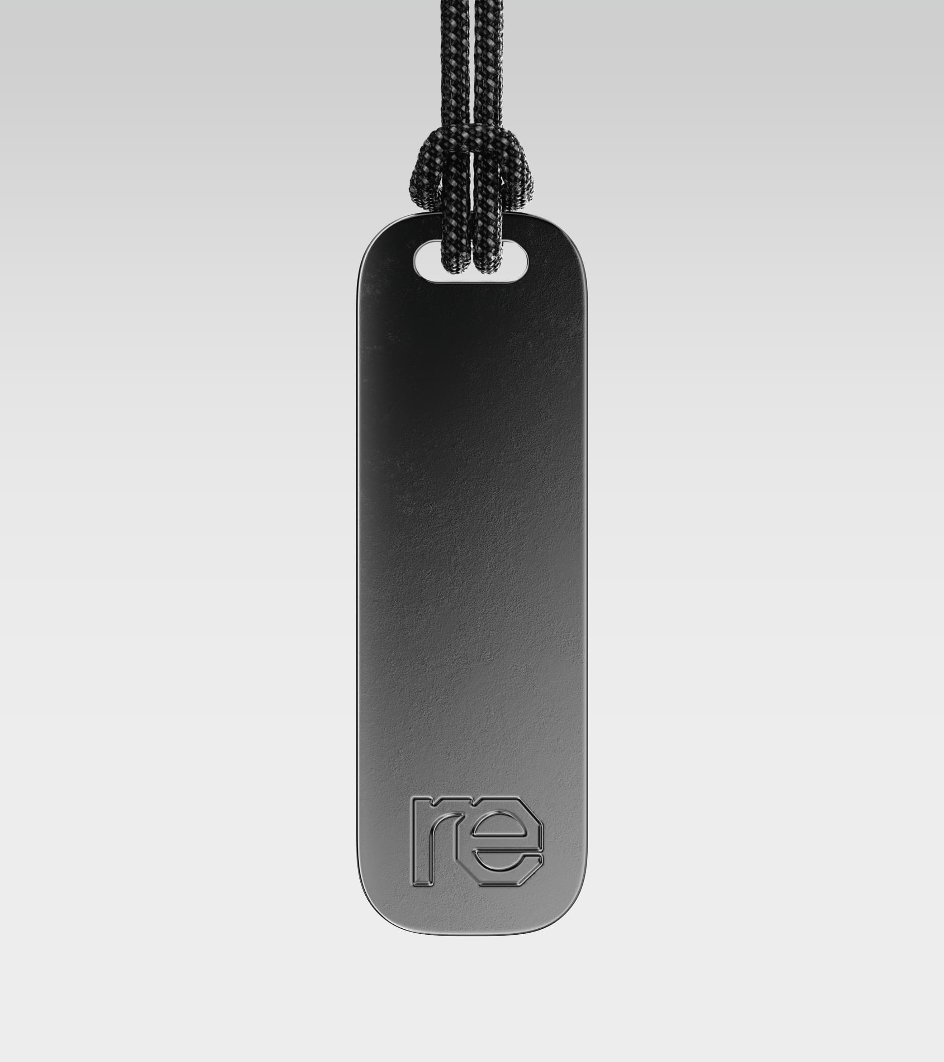
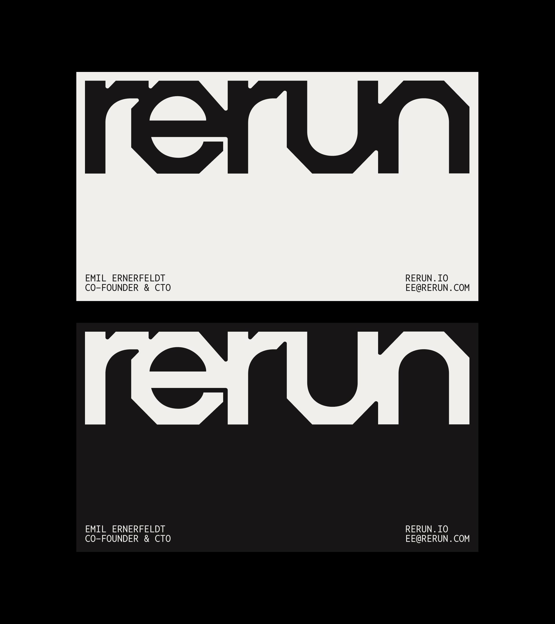
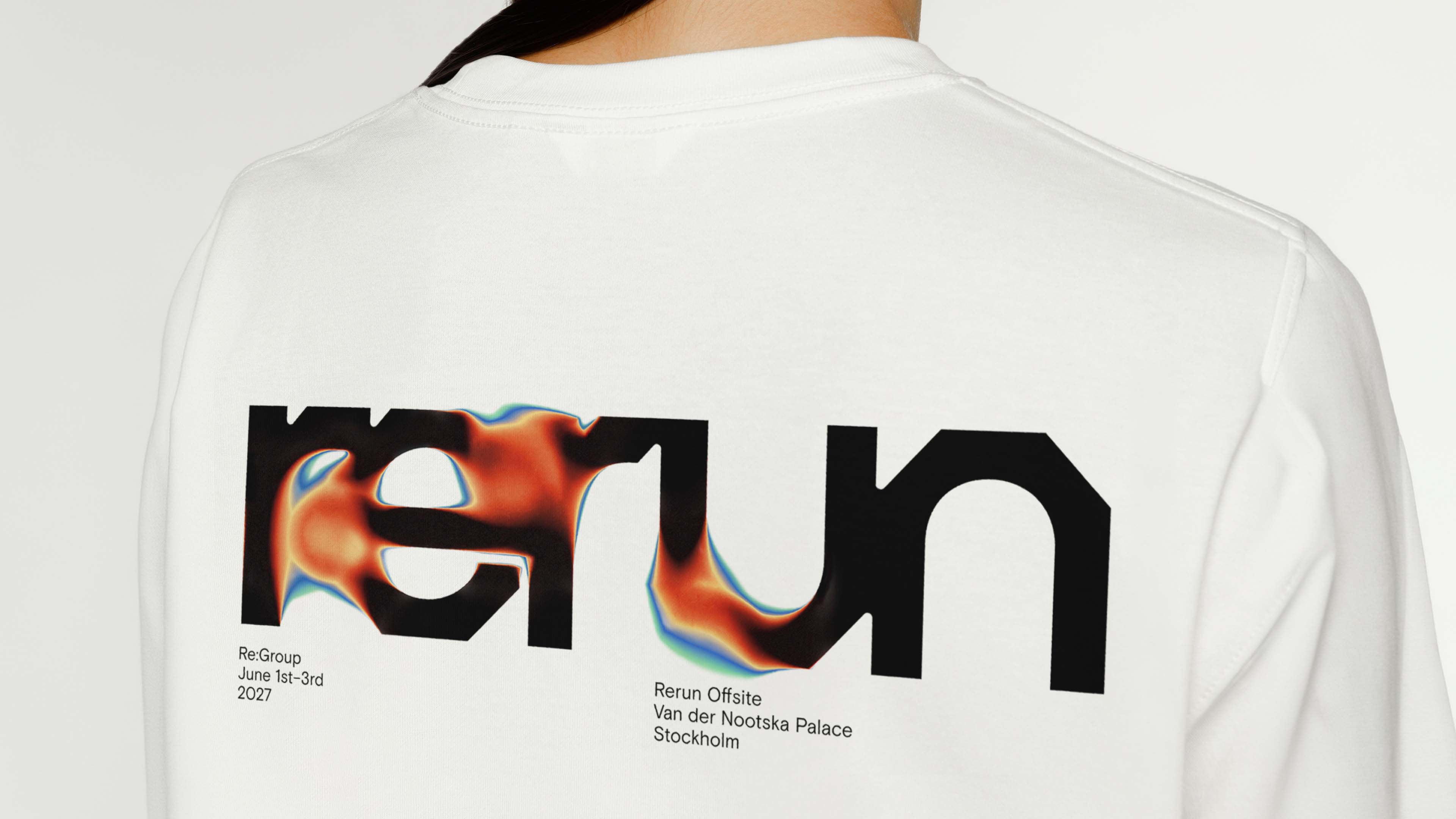
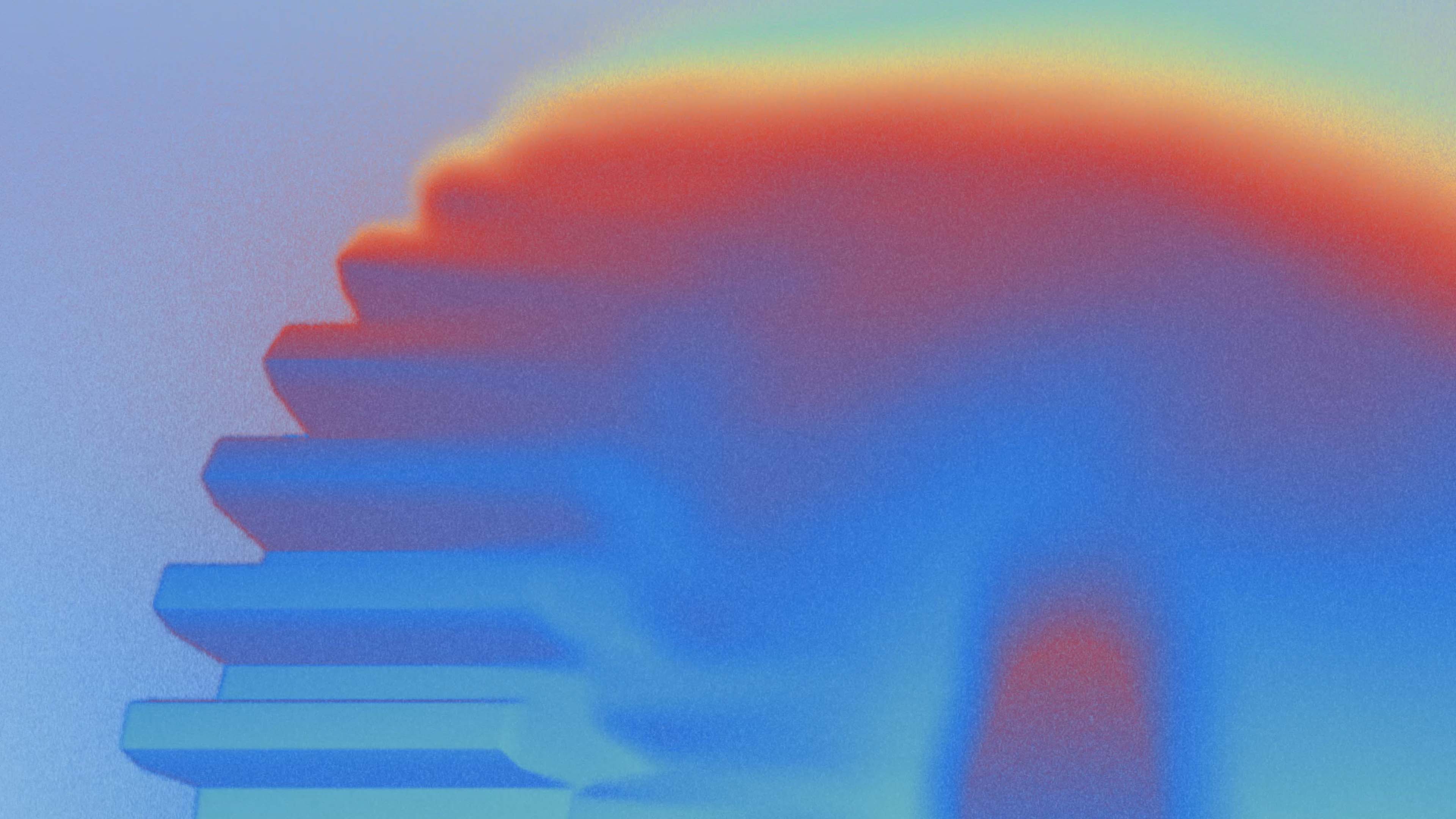
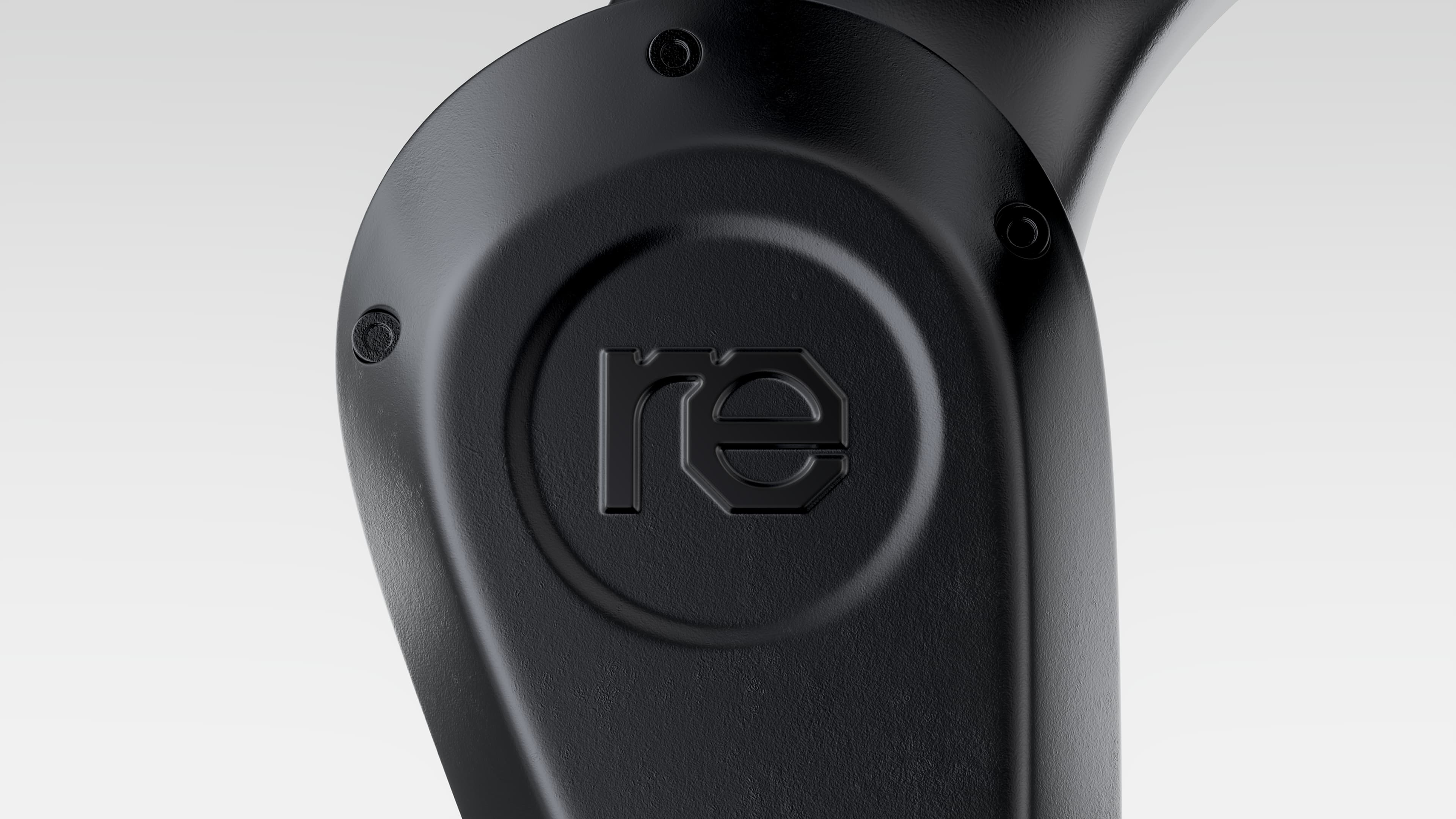
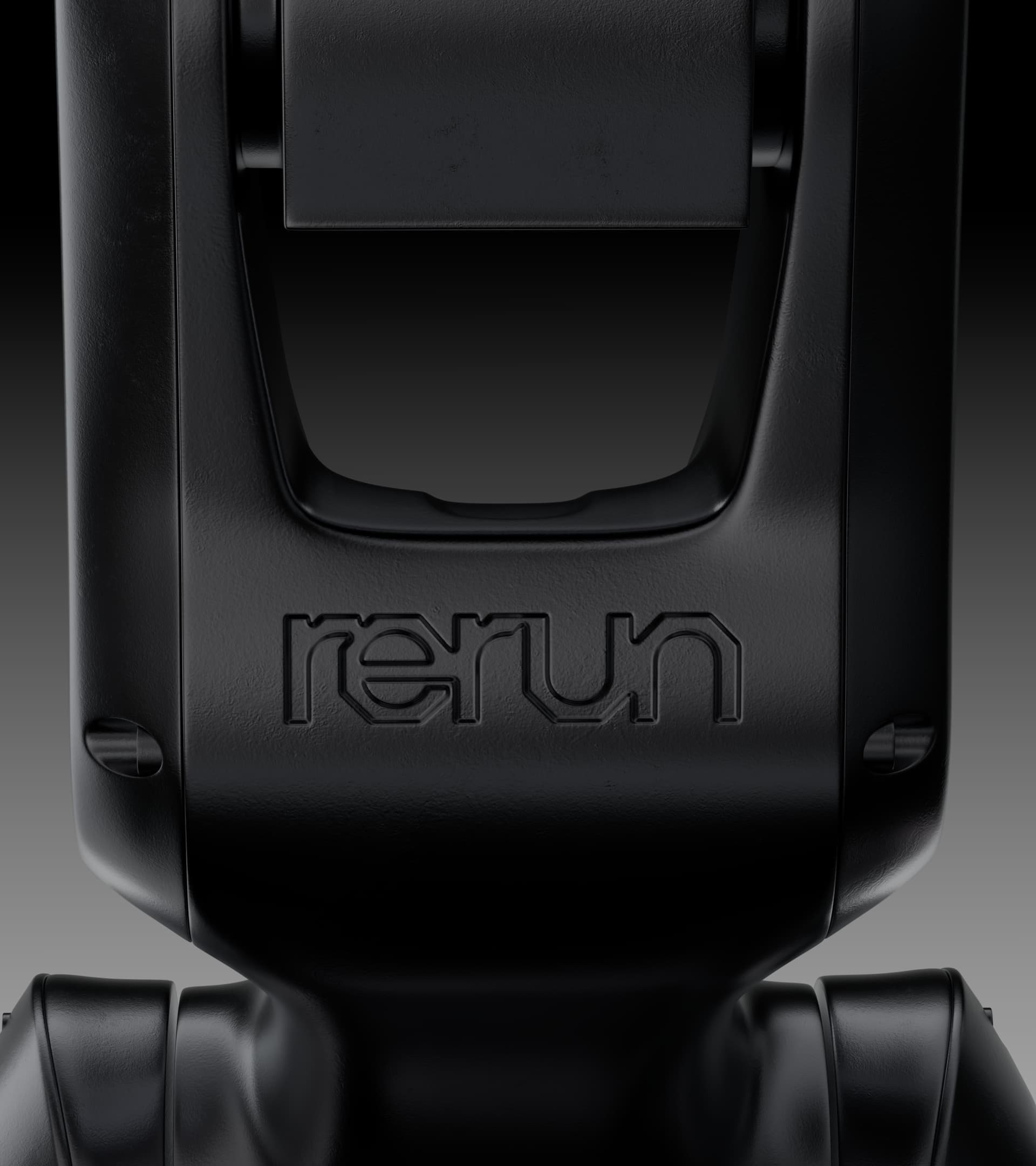
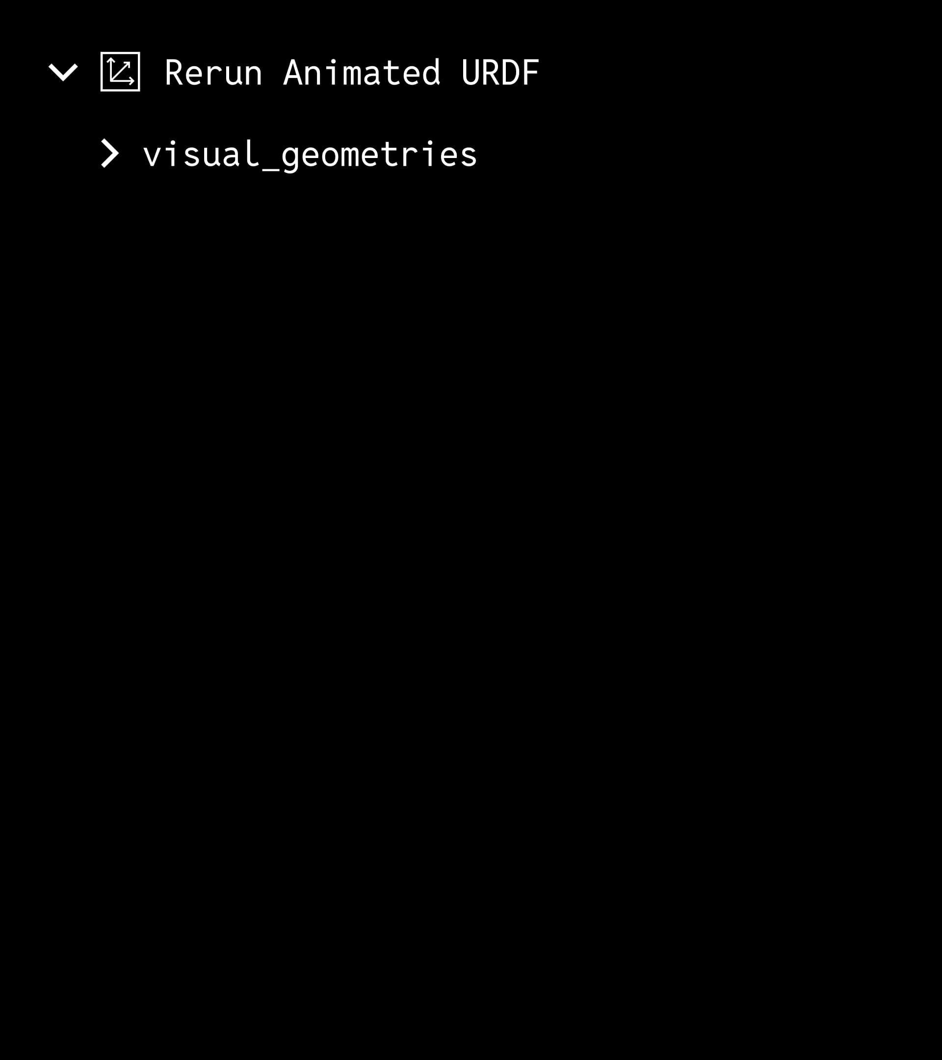
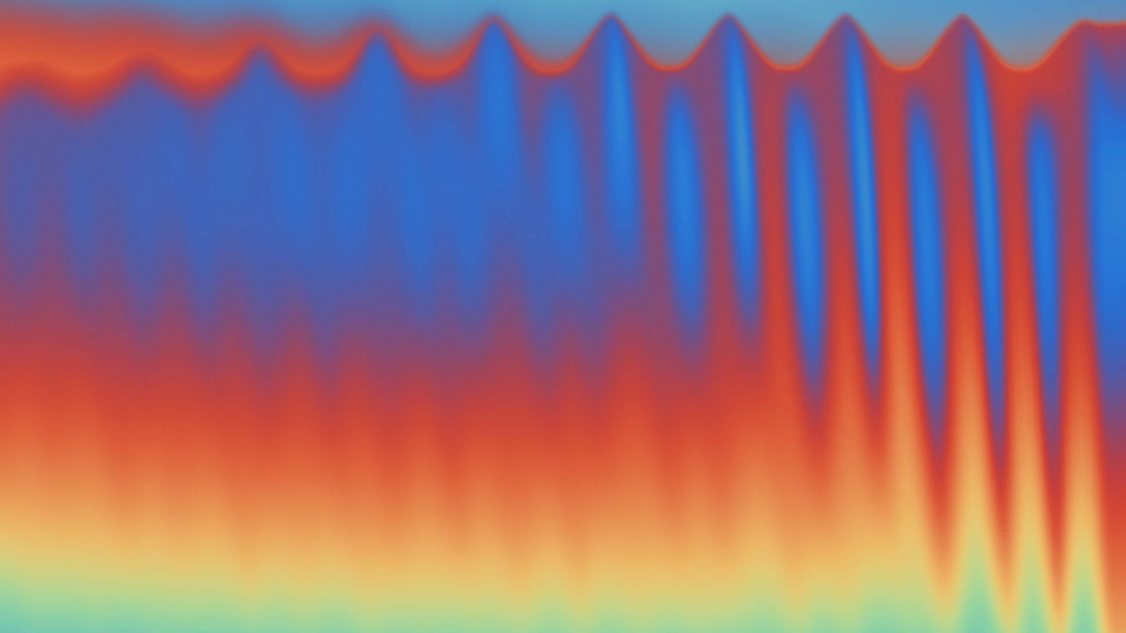
The wordmark takes its geometry from the head of a bolt, the lowercase e at its centre, faceted into angular forms every other letter follows. The colour palette is built on the Jet colormap and its smoother variant Turbo, the way robots see the world, grounded by noir, sandpaper and white. Basis Grotesque pairs with Reddit Mono, held together by a robust grid across every channel. The result is a full suite of artworks in still and motion, logo frames and applications across digital and analog touchpoints. A clear, rational identity that breaks the category visuals while staying grounded in research.
Creative Credits
Creative Direction
Malte Gruhl
Design Lead
Emma Damiani
Design & 3D
Yuriy Starikov
Design & Artworks
Joma Frenzel
Development
Matthias Schulz
Motion Design Case Study
Duncan Brazzil